Context
Mesfin&Co is a Geneva-based company specialised in B2B consulting. The motto for their five associates is “simplify to react,” in other words: support creative teams and work with them to develop ambitious growth initiatives.
Challenge
Our task was to create three different visual identities that could be uniformly expressed across the three services offered by M&Co, which are:
- smartesy > Unlock and define services
- co-skills > Update and renew skills
- adhocology > Anticipation management
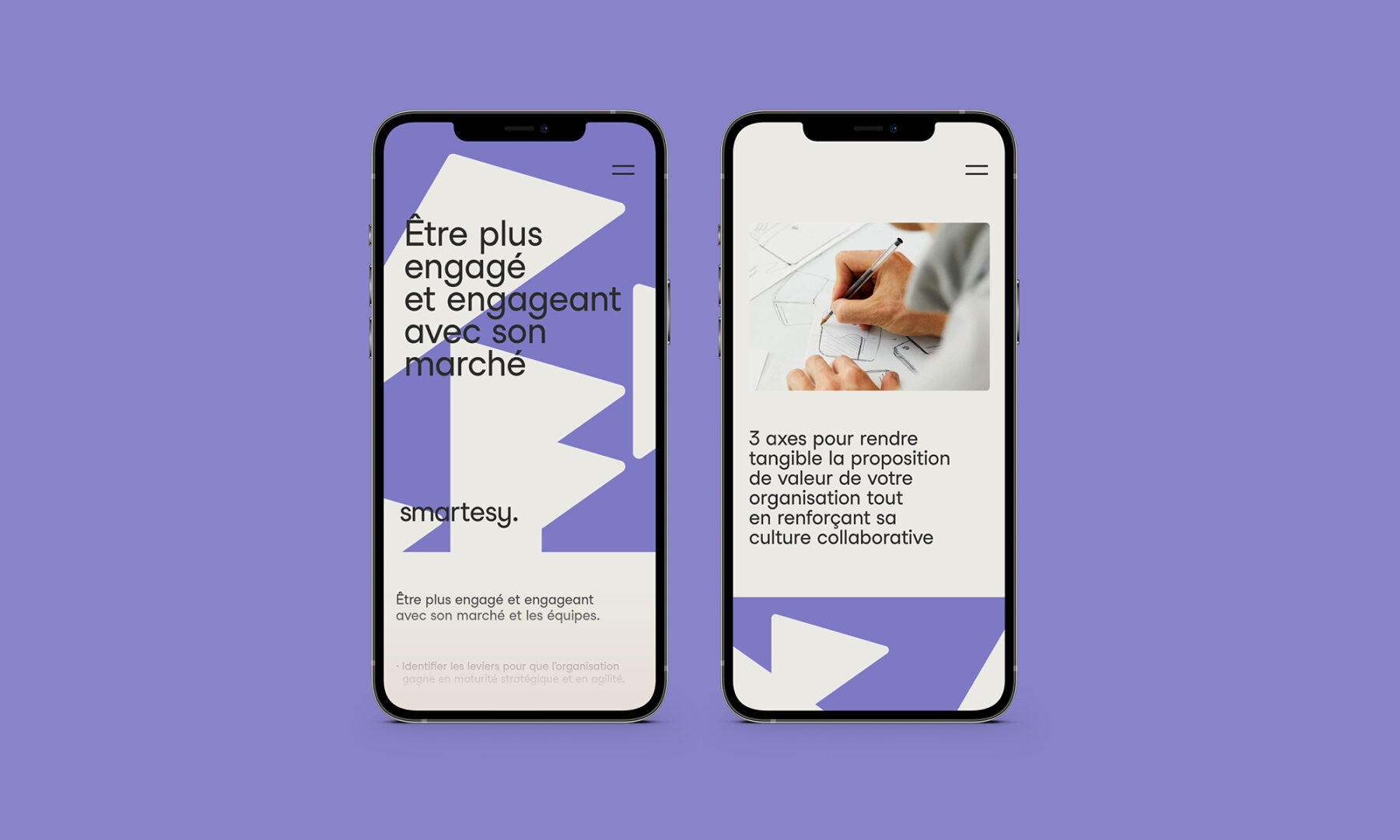
We also needed to ensure there was a clear, visual common thread between the three brands – with the possibility to expand the concept should additional brands evolve over time within the company – and ensure the visuals could be used as mobile application icons.
Services
Brand identity
Motion design
Client
simplexifier


Solution
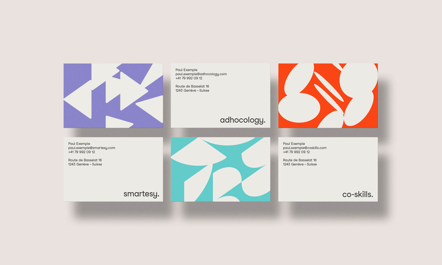
We began by doing a deep analysis of each brand and its parent entity to determine their commonalities and develop their shared identity system. From there, we then created portraits for each of the three brands to clarify their unique distinguishing characteristics and personalities.
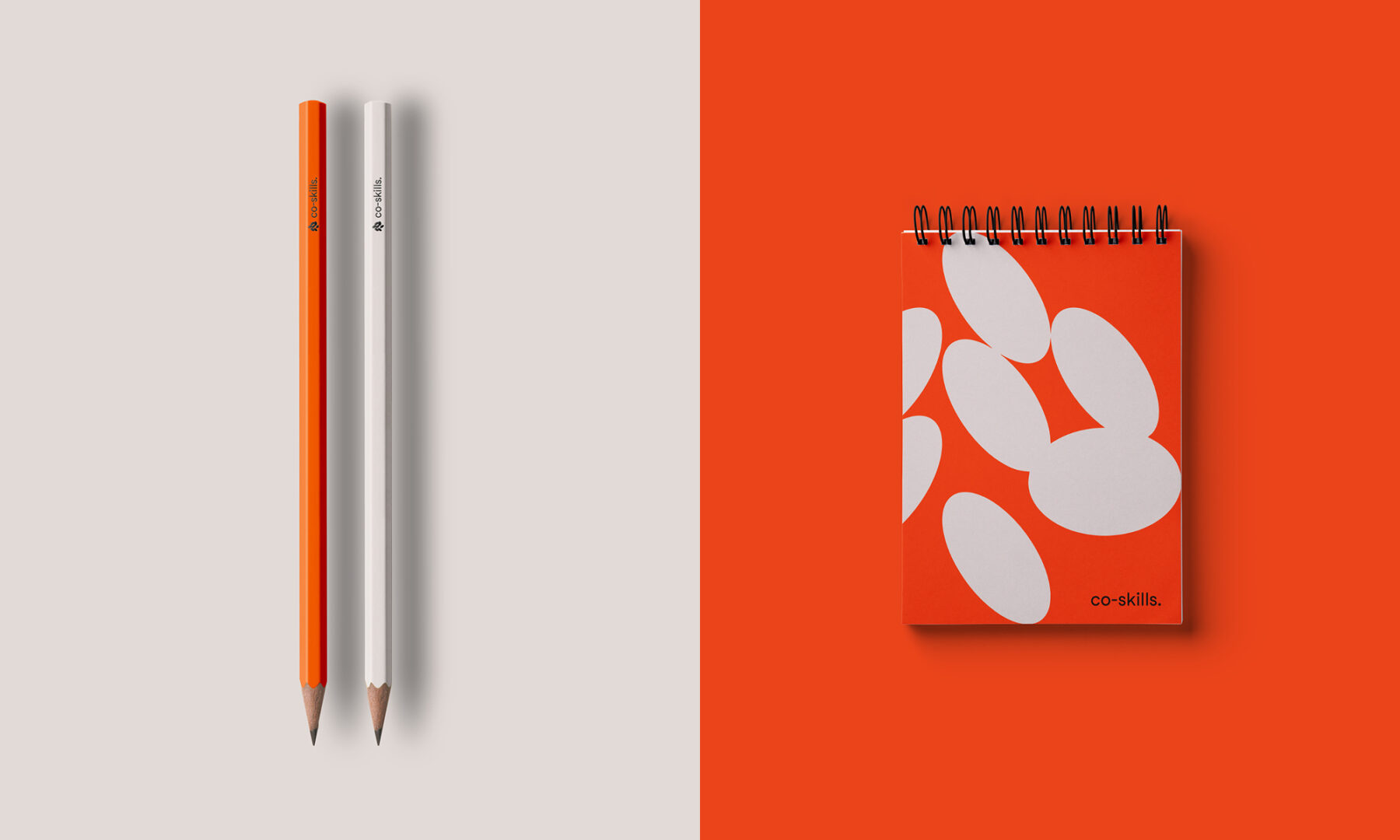
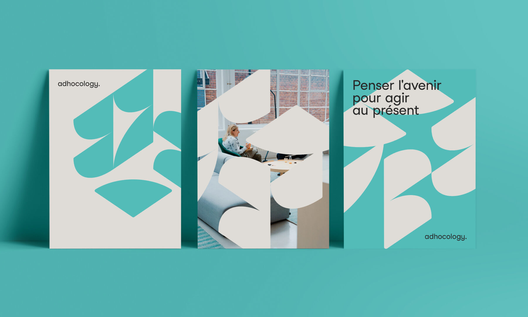
As part of the shared visuals, we developed a three-dimensional graphic matrix, which allowed us to pull out different graphic shapes that were specific to each brand’s logo. The viewing angles and movement offered by the matrix gave each brand a multitude of options to work with. We also gave each brand its own signature colour: mint blue for smartesy, coral orange for co-skills, and lilac for adhocology, complimented by anthracite and sand as secondary colours. The final chosen font was Studio Feixen, which was developed by the Swiss type foundry of the same name.


Milestones
- Create a family of strong visual identities based on a three-dimensional graphic system
- Simplify and unify brand speeches
- Bringing innovation through design (motion design)
- Perpetuate the graphic system by establishing graphic guidelines
Want to talk about your next challenge?
→ Let's get in touch
++
Hymn Design Sàrl
Rue de Lausanne 64
1020 Renens — Switzerland
