Context
Aoris is the new one-stop platform in the canton of Vaud for everything related to social and healthcare careers, training, promotion, and stability. The June 2023 General Assembly confirmed the name and statutes of the new platform, which merges what was previously divided across two separate organizations – CIPS (responsible for communications and promotion of healthcare and social professions, along with the management of nurse re-entries and career shifts) and OrTra Santé-Social Vaud (which oversaw professional interests, training, promotion, and the long-term stability of healthcare and social work professions). The uniting of these two entities into one creates a stronger and more complete community platform moving forwards.
Challenge
This project presented multiple challenges and several workshops were needed to define the new platform’s strategy and identity. Research and multiple interviews were also required to fully understand the various roles involved in this very rich ecosystem, which includes employers, employees, partners, students and their families, social institutions, professional schools, hospitals, cantonal authorities, individuals converting into or out of the industry, etc. On top of that, we all know that simply finding a name and visual identity is not enough to bring a brand to life – for the brand to be successful, every stakeholder needs to share in the brand’s communal vision, mission, and values. Our proposal needed to be humane, unifying, and offer a touch of modernity.
Services
Strategy
Brand Platform
Naming
Brand Identity
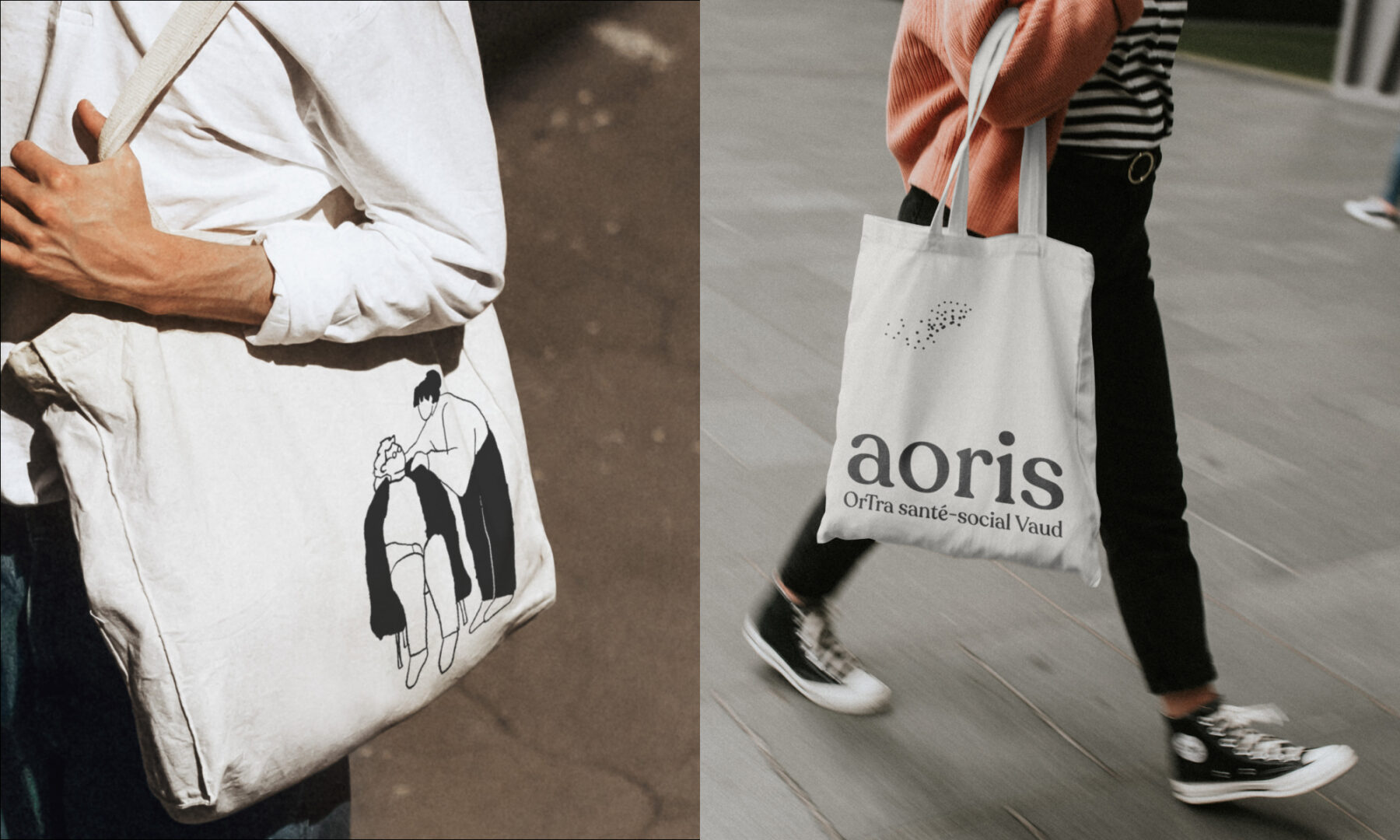
Printed Collaterals
Web Design
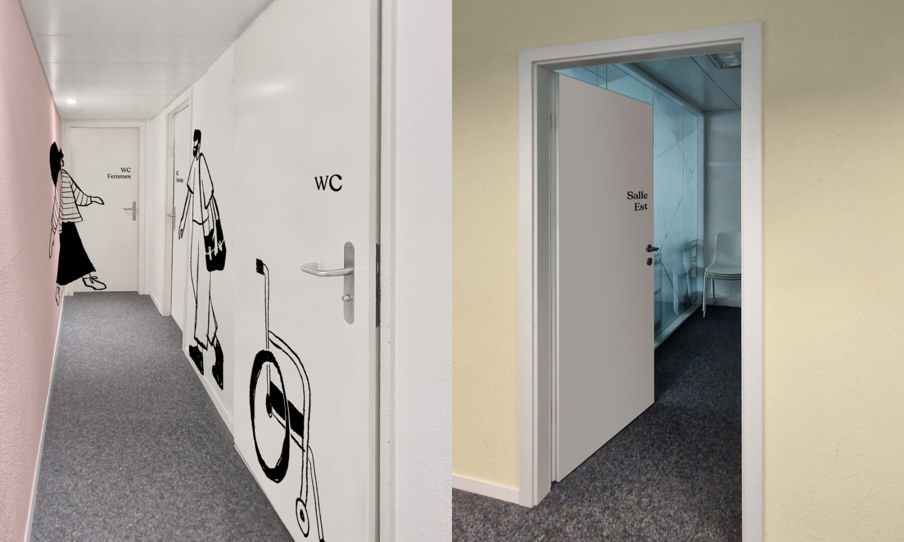
Signage Design
Motion Design
Client
Aoris, OrTra santé-social Vaud


Solution
Determining a name for this new platform proved challenging. These industries tend to use acronyms in an effort to be concise, efficient, and unbiased. But merging two acronyms was next to impossible, so we opted to break the mould. We proposed a more ethereal, inspiring name, which was both easy on the ears and easy to remember: “Aoris.”
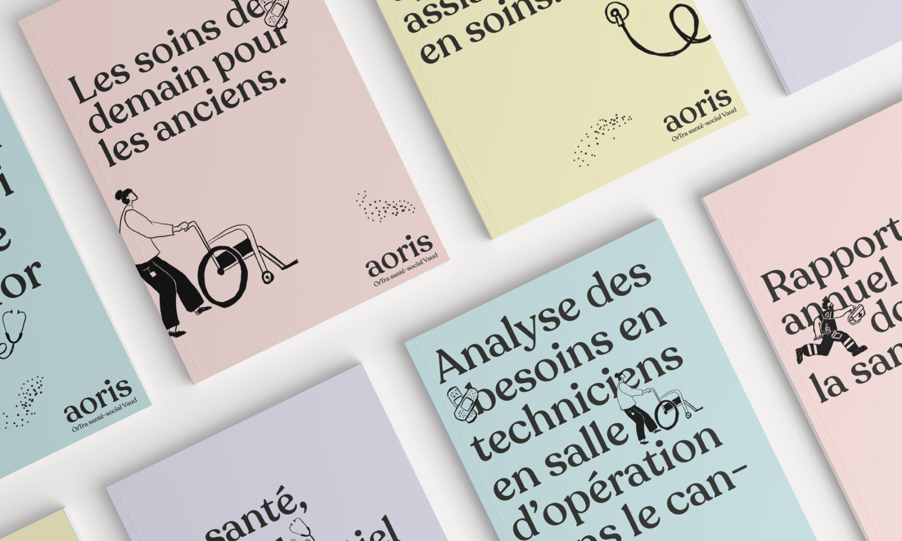
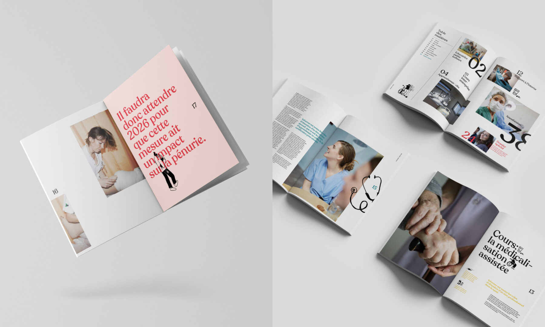
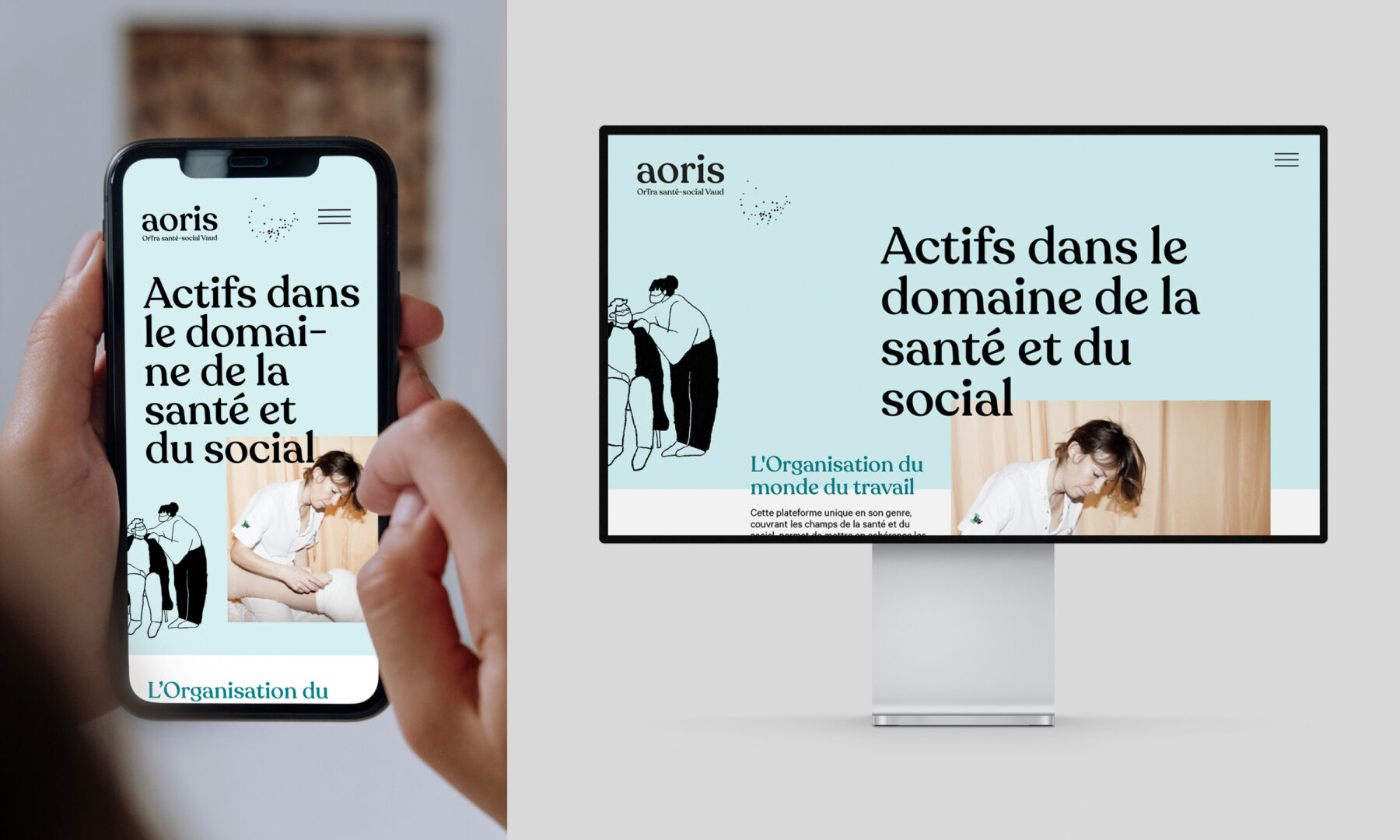
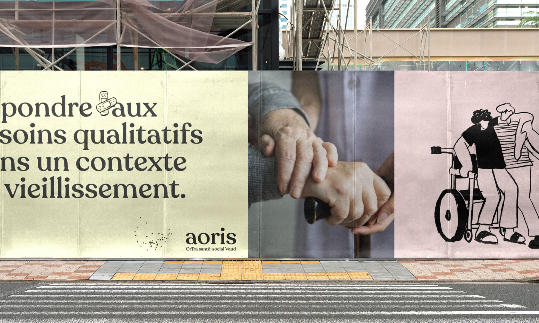
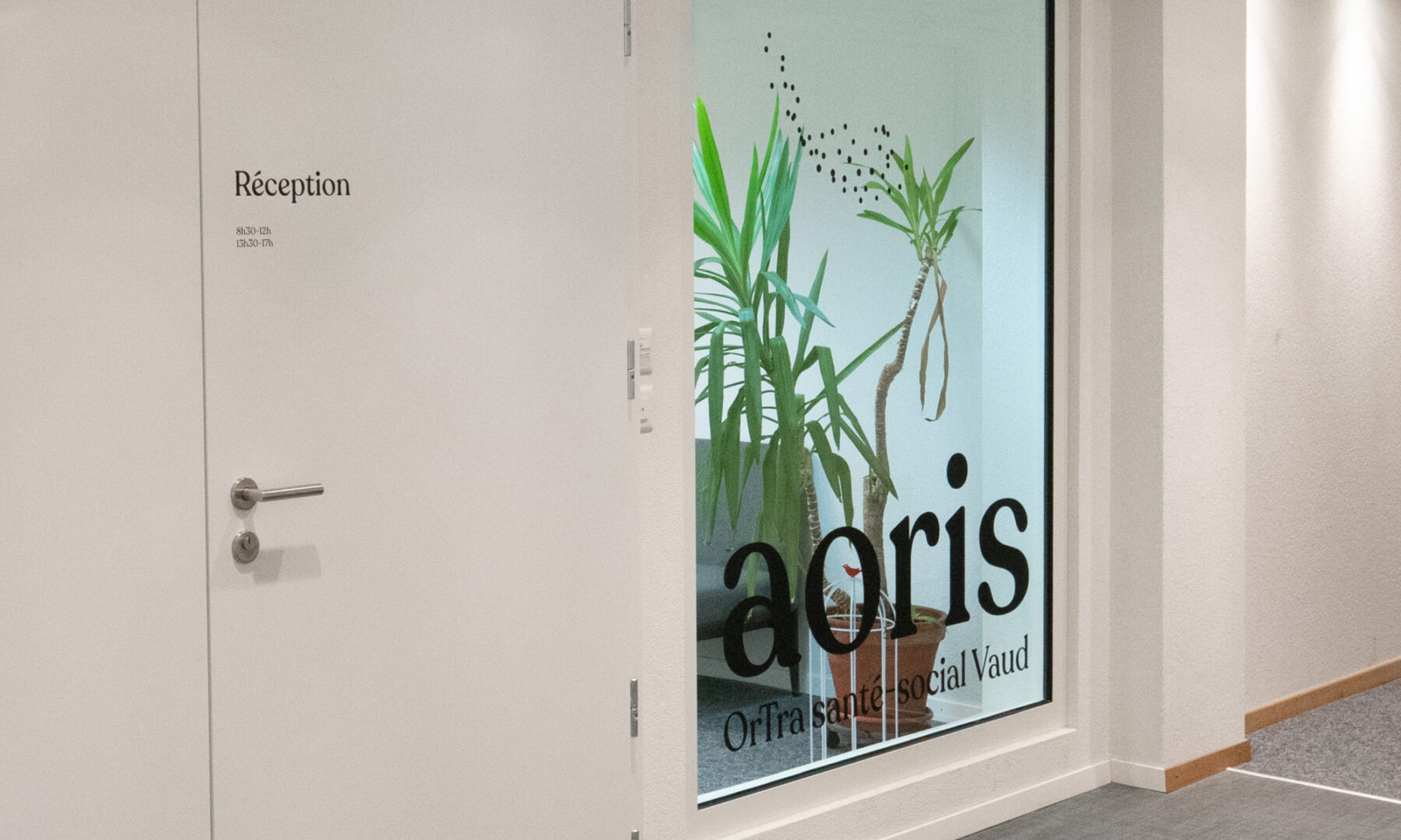
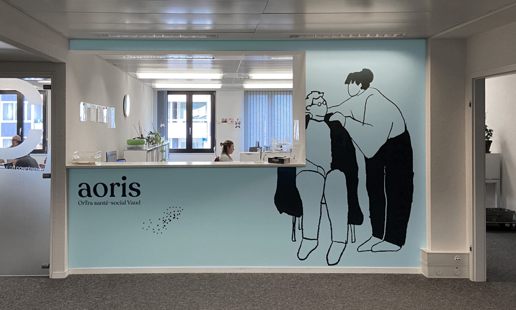
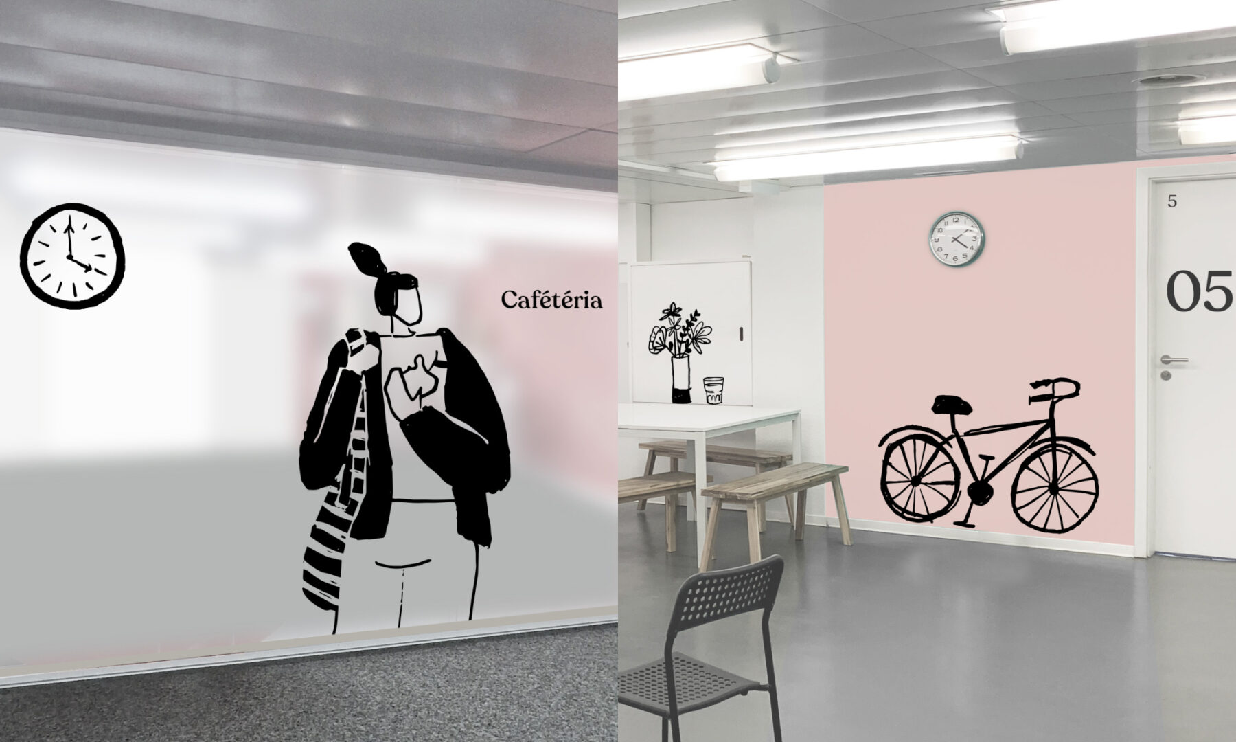
After developing the name, we shifted our attention to the brand’s visual universe. We established various elements that could operate individually and yet also form a cohesive whole, much like the mission of the various stakeholders involved in this project. We used the typeface Recoleta for its softness and generous curves, along with two complimentary colour palettes: one being calming pastels, and another composed of vibrant, zesty colours. We also created a murmuration of birds out of small dots that come and go, inspired by the many moving parts of this community that work together to form a single unit. It’s a constant reminder that Aoris is more than a simple sum of its parts, and that we are always stronger when we work together.
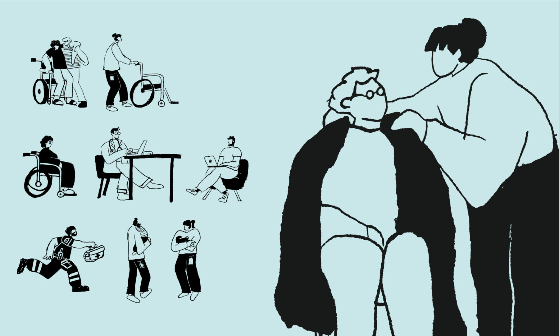
Lastly, we set our sights on the visuals. Given the context of this project, image bank photography was simply not an option, so we opted for illustrations that are intentionally imperfect and imprecise, along with a selection of authentic photography. A far cry from studio work, we sought to reaffirm and reassure by portraying real life, real people, and real industry careers in the chosen images.
Milestones
- Develop a strategy and branded platform for Aoris, a new community brought to life through the merger of CIPS and OrTra Santé-Social Vaud
- Define the new platform’s communal vision, mission, and values, and transmit them through a memorable brand identity and visual ecosystem
- Create a visual identity that’s humane, generous, and reliable
- Unite all industry stakeholders around the new proposal
Want to talk about your next challenge?
→ Let's get in touch
++
Hymn Design Sàrl
Rue de Lausanne 64
1020 Renens — Switzerland
