Context
As an early learning institute, IHSD was known for its comprehensive development and support services for children between the ages of 0-5 years old. Families put their trust in IHSD to prepare their children to enter the local school system. In a relatively competitive sector, IHSD needed to revisit their branding so they could stand out and also attract additional financial support. The institution tapped Stitzlein Studio for the project, a California-based brand consultancy studio, and a collaboration between our two offices was born, with the goal of revitalizing IHSD's branding and design.
Challenge
Together with Stitzlein Studio, we quickly identified the gap between IHSD's branding and their values. Their brand acronym was difficult to remember and their visual universe was very serious, which created an obstacle in helping them stand out from the competition for public and private fundraising. We needed to return to the source of this benevolent program's identity and bring that essence to life in a new name, a transformed tone of voice, and an updated visual code. The program's strong Californian roots, and specifically its connection to the Bay Area, were a key source of inspiration.
Credits
Creative Direction: Joe and Leslie Stitzlein
Brand writing and naming: Austin Howe
Art Direction & Design: Hymn
Client
IZZI (ex-IHSD)
Solution
Working with our friends at Stitzlein Studio, we dove into the Pacific Ocean, as it runs close to the Californian shore and the institution's four locations, to find the heart of our client's new identity. Where ocean meets land, a unique geographical feature comes to life between high tide and low tide. This area is known as the intertidal zone, and it became the inspiration for the new name of the schooling institute: IZZI. Intertidal zones are home to unique communities of plants and animals that prosper in this "in between," as the water rushes in and out. Working together, these communities ride the waves of life to thrive, much like our client does on a daily basis through the work they do in their local community.
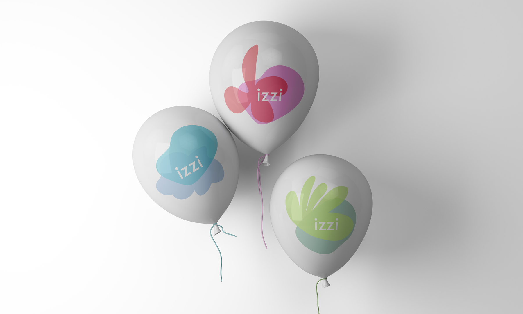
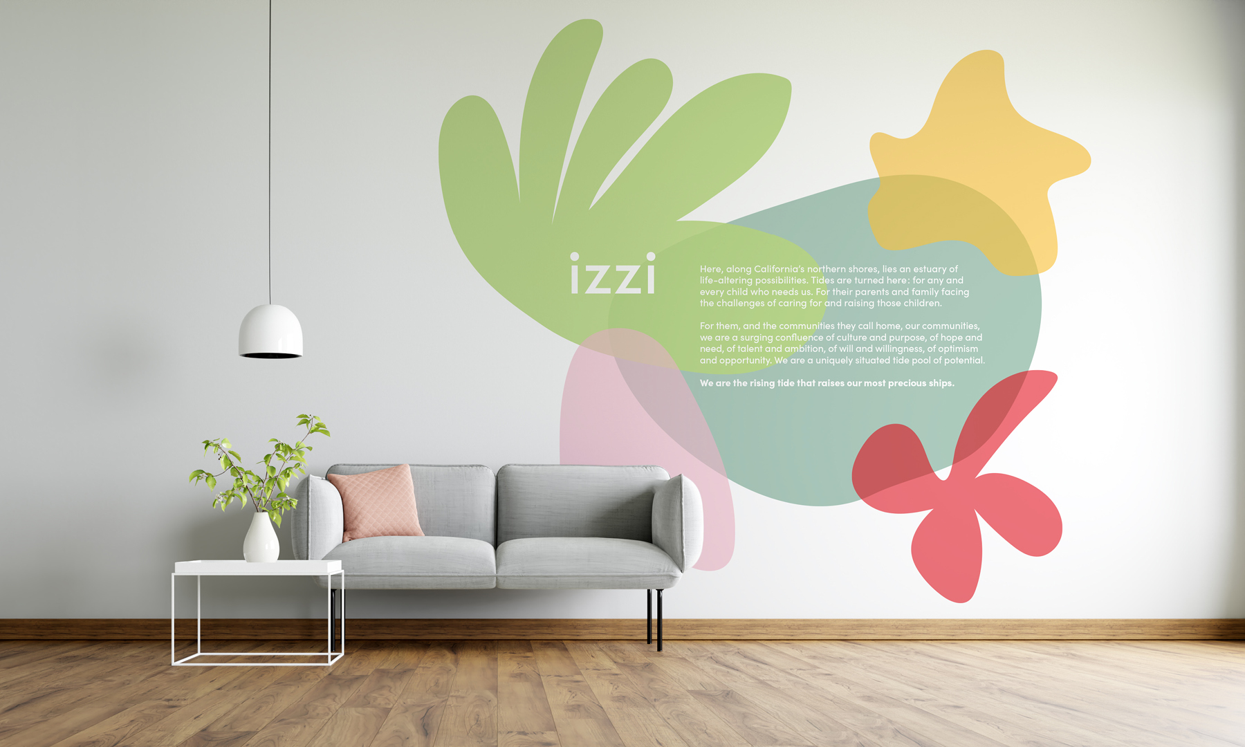
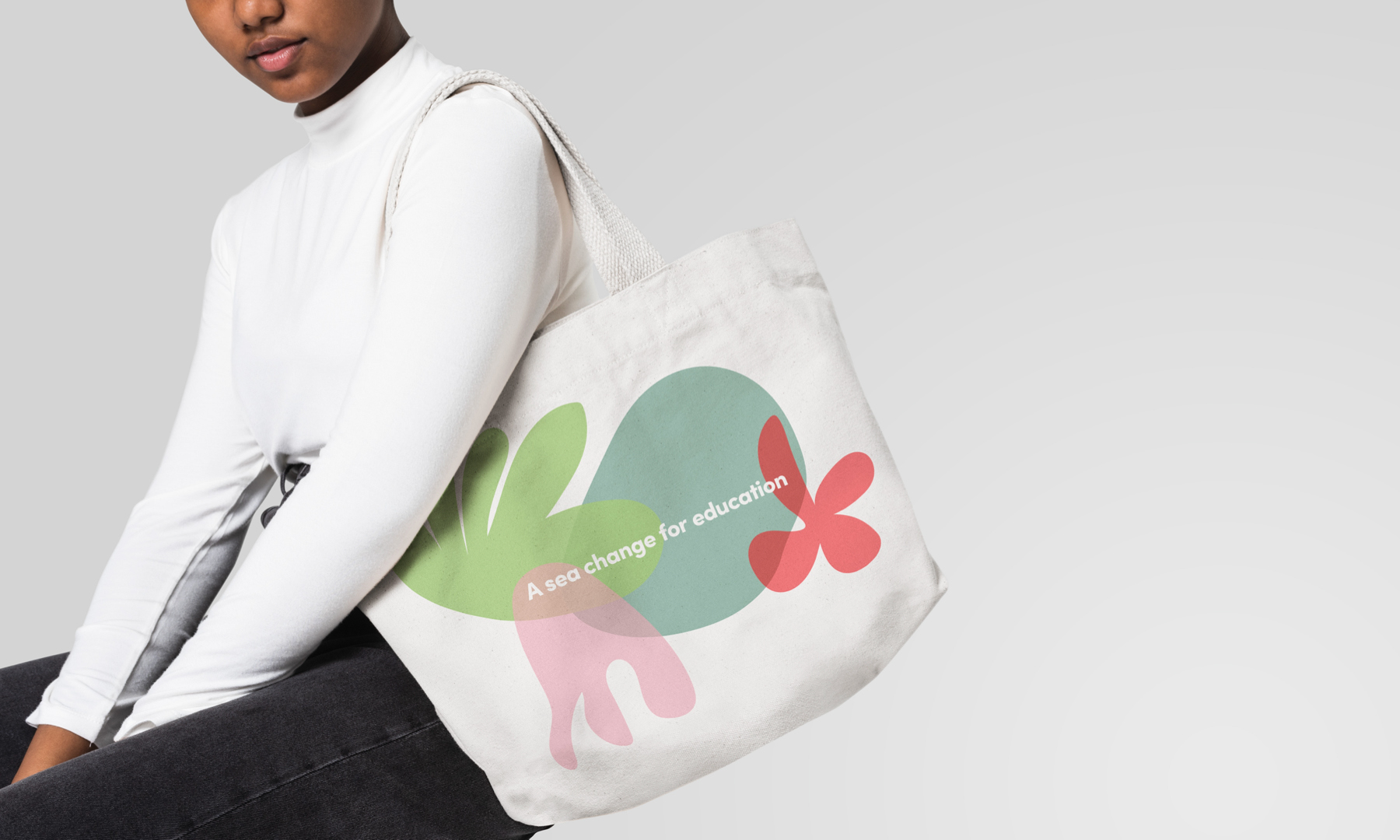
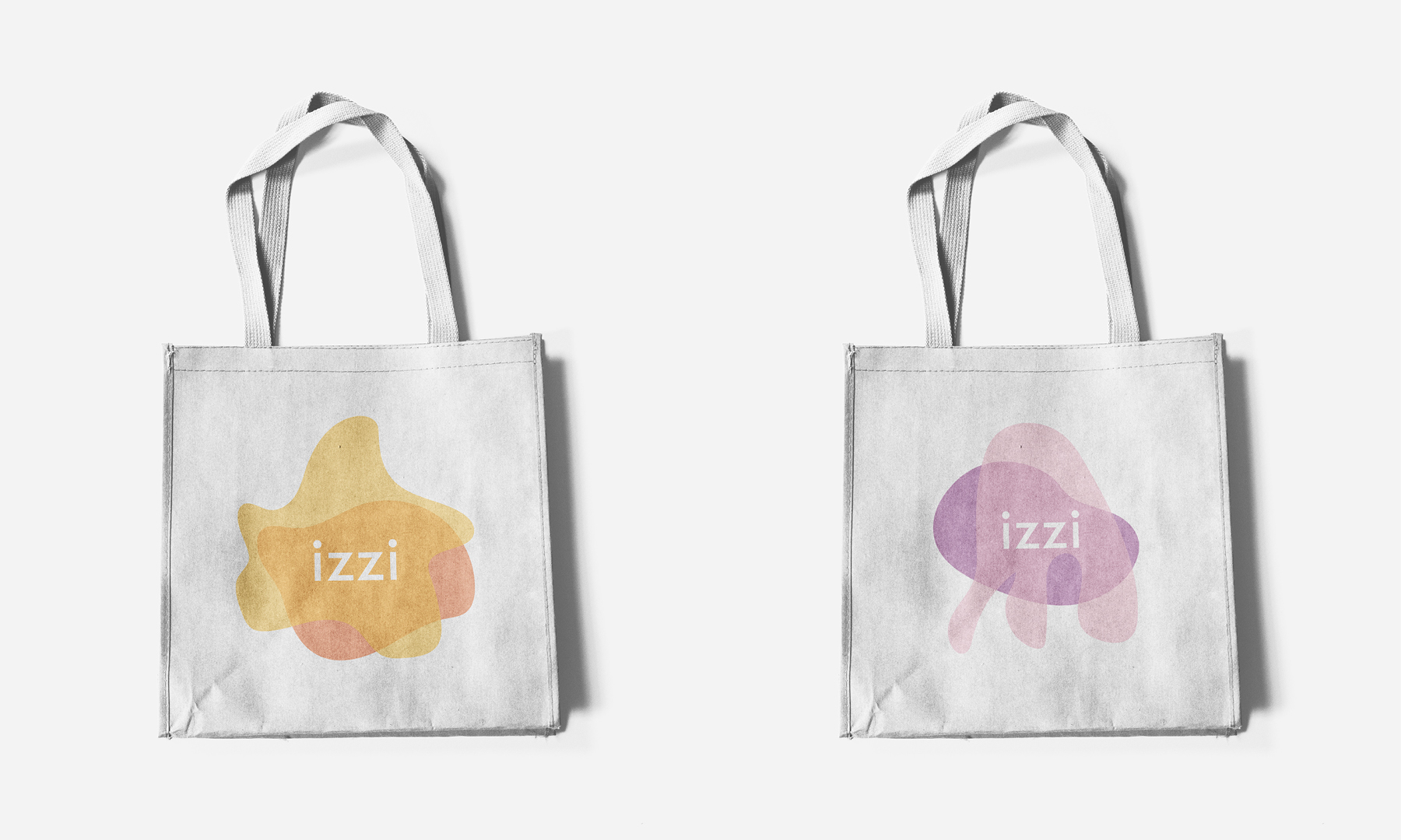
Rather than create a single logo, we opted to create a family of six logos featuring different marine creatures. This choice reflected the magical world that IZZI's children, families and educators create as they work towards their common goal. These logos reflect the diversity and vitality of the IZZI community, as they are all created equal and can be used interchangeably.
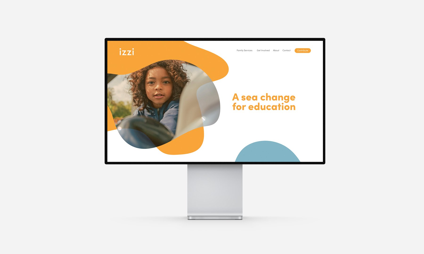
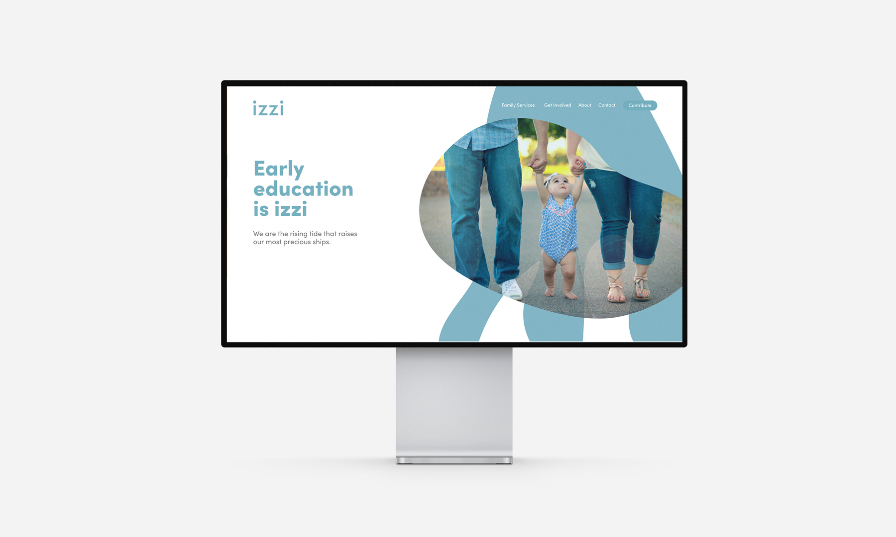
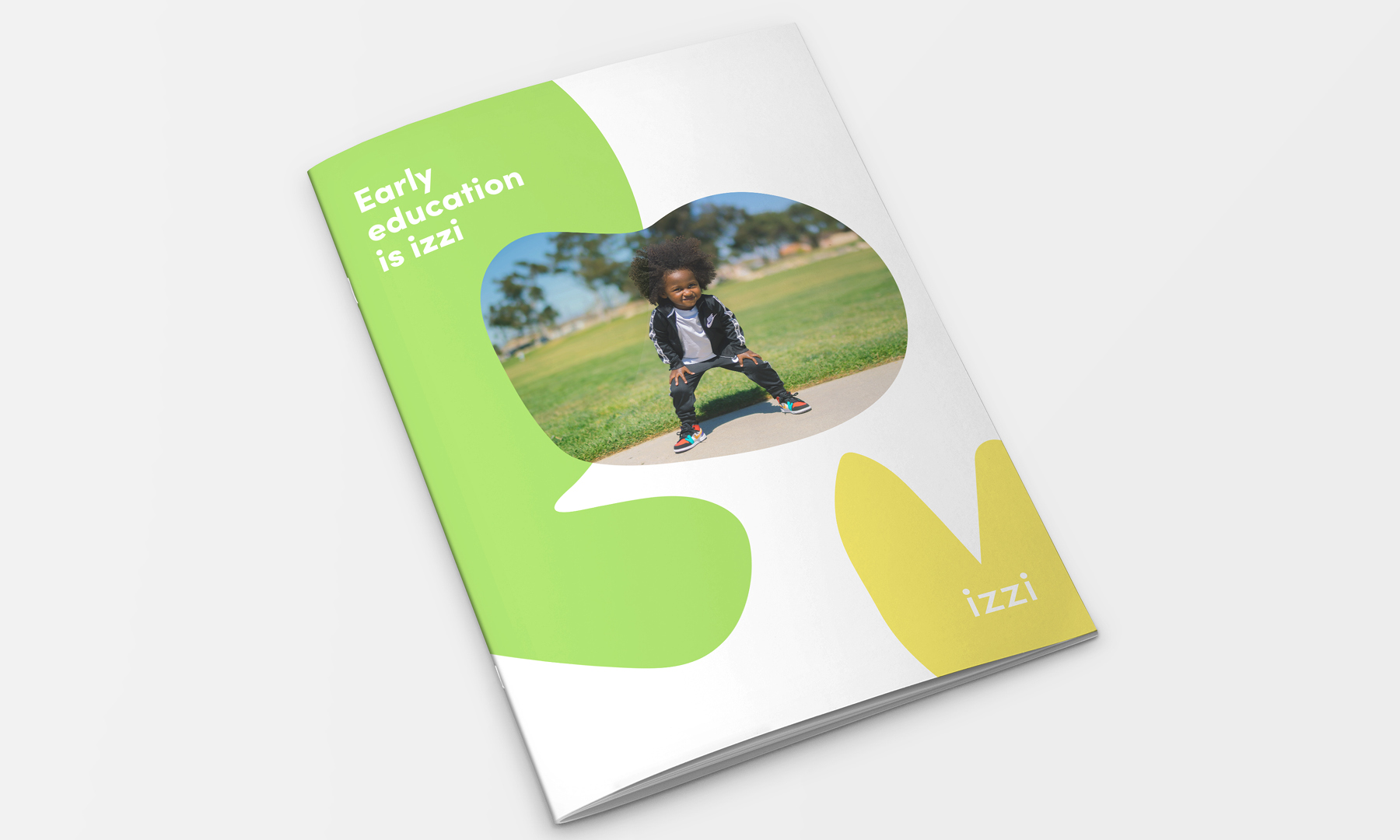
The simple and friendly name IZZI, its colorful family of logos, and its new, gentle typography give the educational institute a fresh brand identity that embraces its core values and the wonder of childhood. The designs were adapted for use on the company's website, for print in its brochures, for signage, and beyond.
Milestones
- Transform an educational institute into an inspiring children's brand
- Stand out and also attract additional financial support
- Developed a unique communication style to clearly differentiate from competitors
- Inspire and motivate employees
Want to talk about your next challenge?
→ Let's get in touch
++
Hymn Design Sàrl
Rue de Lausanne 64
1020 Renens — Switzerland
