Context
Sparkle offers its services to hotels, restaurants, and cafés located in Nordic countries (Sweden, Denmark, and Finland) by representing brands like Nespresso, Kusmi Tea, and Be Water filtration systems. Their role? Improve one’s everyday experience by offering innovative services for coffee, tea, water, and snacks.
Challenge
The first challenge Hymn was asked to tackle was to find a way to unite the various international teams—despite cultural differences between Sweden, Denmark, and Finland—behind a single brand for this service company. Enter Sparkle.
The second challenge was to create a sense of solidarity within Sparkle amongst all team collaborators, who up until now had identified with the well-known brands they represented (Nespresso, Kusmi Tea, or Be Water).
On top of all that, the brand also needed to instantly communicate the “extra spark” that Sparkle brings to all its projects.
Services
Brand identity
Motion design
Client
Sparkle Nordics
Solution
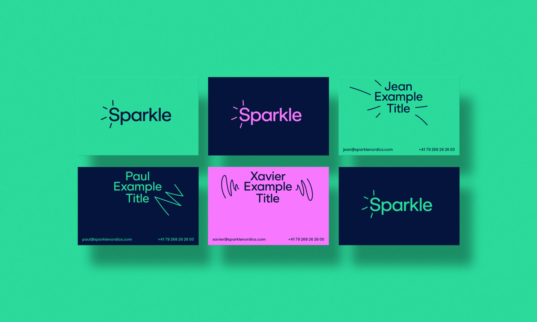
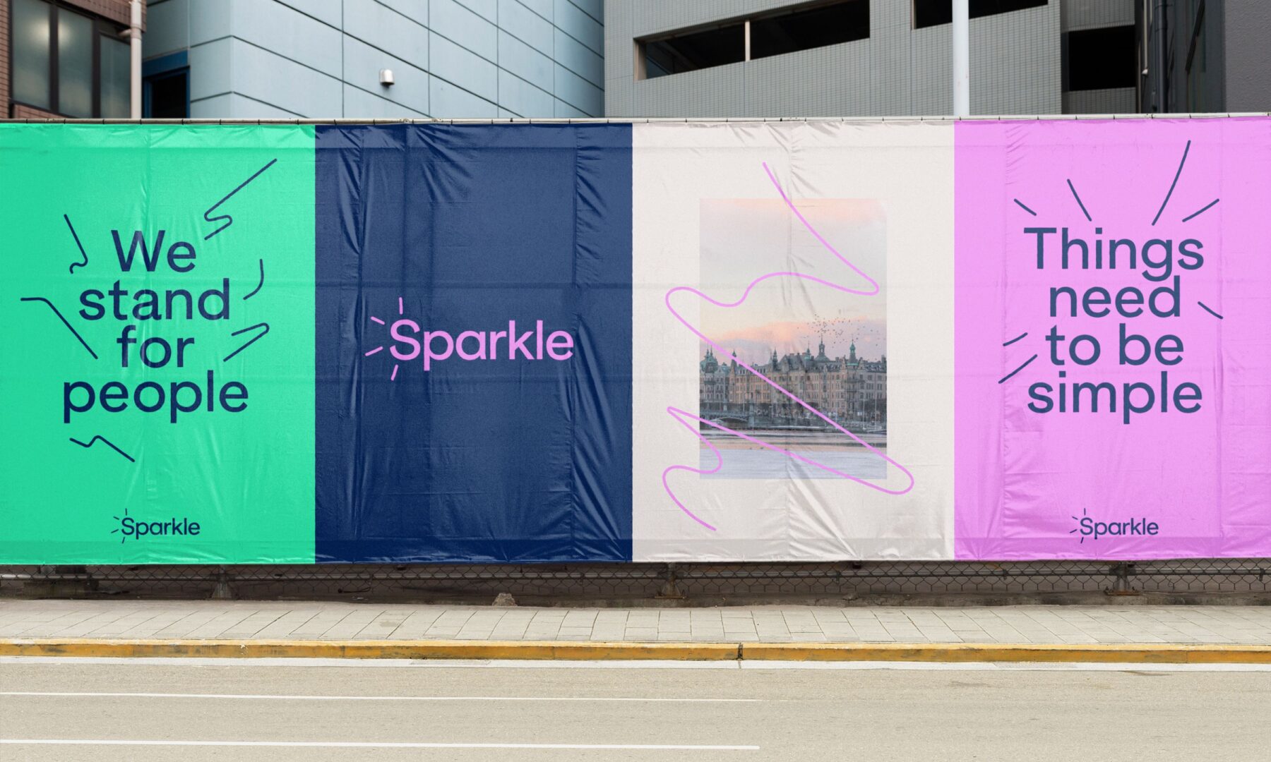
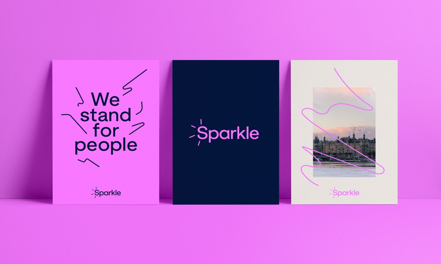
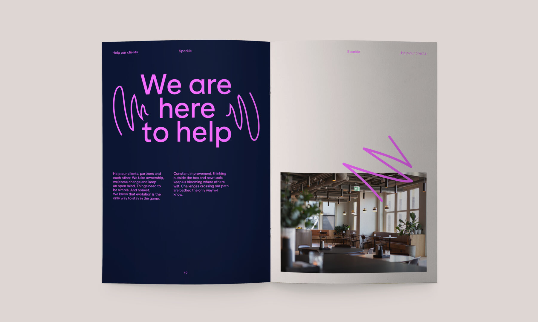
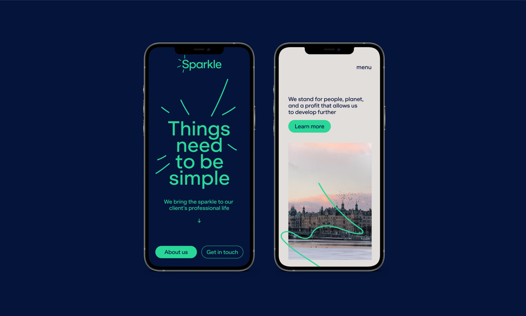
Hymn chose the contemporary, elegant, and optimistic font Klarheit Grotesk, designed by the Swiss type foundry Extraset, to communicate the efficient simplicity of Sparkle’s brand name and concept. We also created small, vibrant “sparkle” graphic elements that bring an animated spark to the logo and the company’s communication materials. These sparkles pop up across the designs, which unfold in a series of understated yet invigorating colours.
The combination of these graphic elements allowed Hymn to create a strong, elegant, and dynamic brand identity for Sparkle.
Milestones
- Create a brand that regrouped teams from three different countries under a single entity.
- Rally team collaborators, who previously identified with the global products they represented, around this new brand.
- Convey a strong image
Want to talk about your next challenge?
→ Let's get in touch
++
Hymn Design Sàrl
Rue de Lausanne 64
1020 Renens — Switzerland
