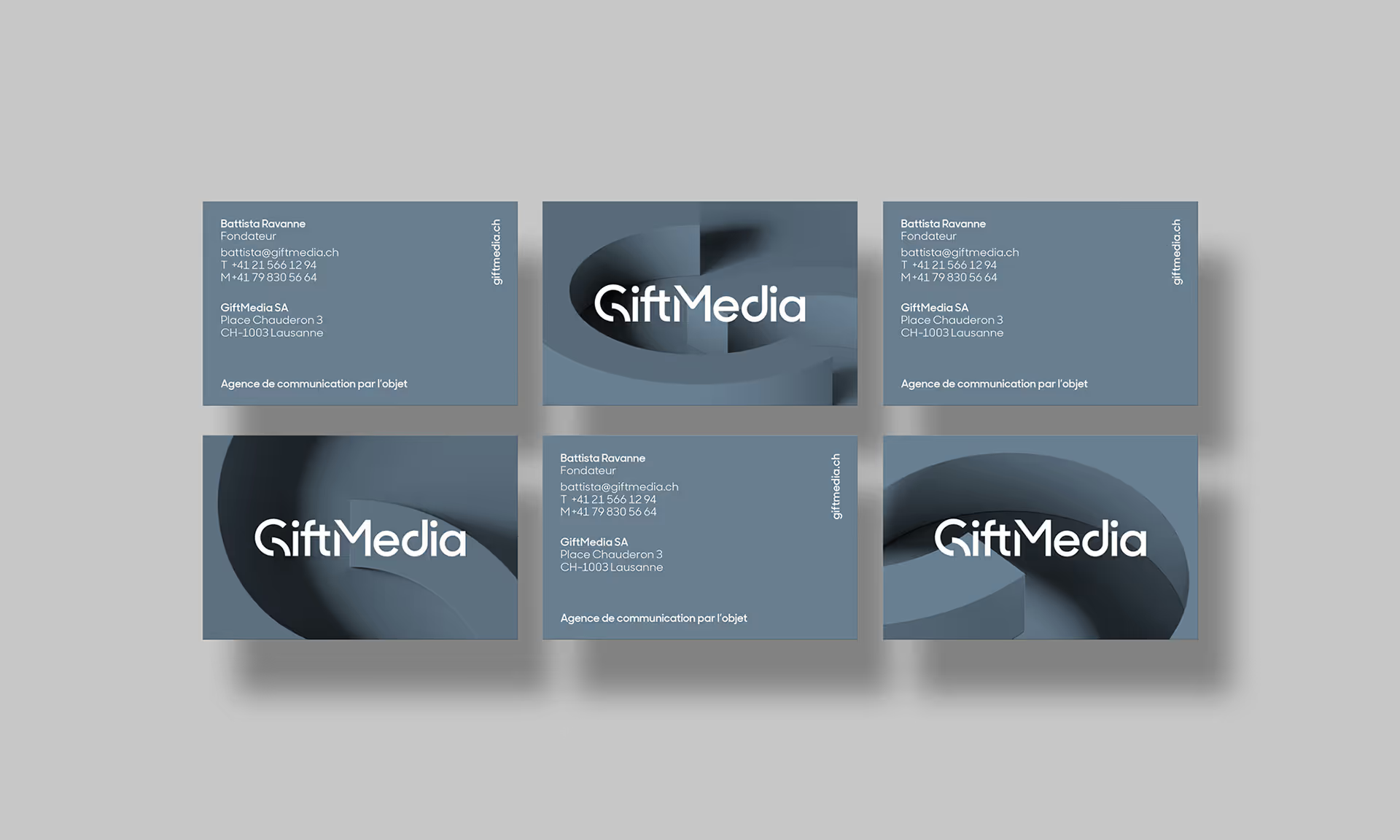
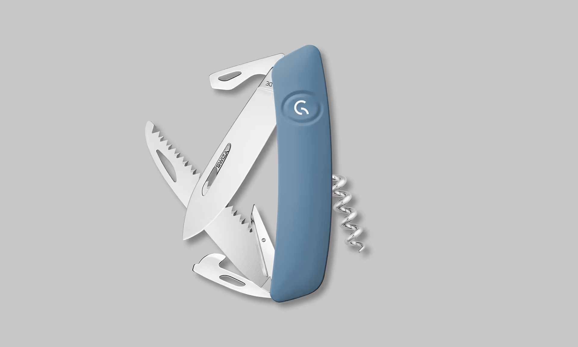
The focal point of the new GiftMedia logo is the letter "G", which infuses the new identity with a strong personality. Its design is inspired by a circle and the concept of perpetual movement, embodying the steadfast character of a timeless brand. The logo is designed to be elegantly and exclusively monochrome.
To visually express the concept of their products without directly showing them, we created a series of 3D animations that feature GiftMedia's "G". The animations evoke that same concept of constant movement while also being reminiscent of physical, voluminous objects in space. By using GiftMedia's "G" as the source material for these animations, they also come to embody a promotional product's ultimate raison d'être : powerful branding.
Use of the 3D animations also extends beyond the concept of video. The brand's physical, printed materials also feature a 3D component in their colored, embossed backgrounds, which ensures all communications materials are aligned with the new brand's identity. Close-up effects add a discreet and implicit brand presence, and everything comes to life in a soft blue grey, chosen for the elegance and premium feel it evokes.
We also developed a graphic chart for the brand's strong character, which allowed us to adapt GiftMedia's new identity and graphic universe across all of their printed materials, notably including stationary, and their digital touchpoints like their website.


