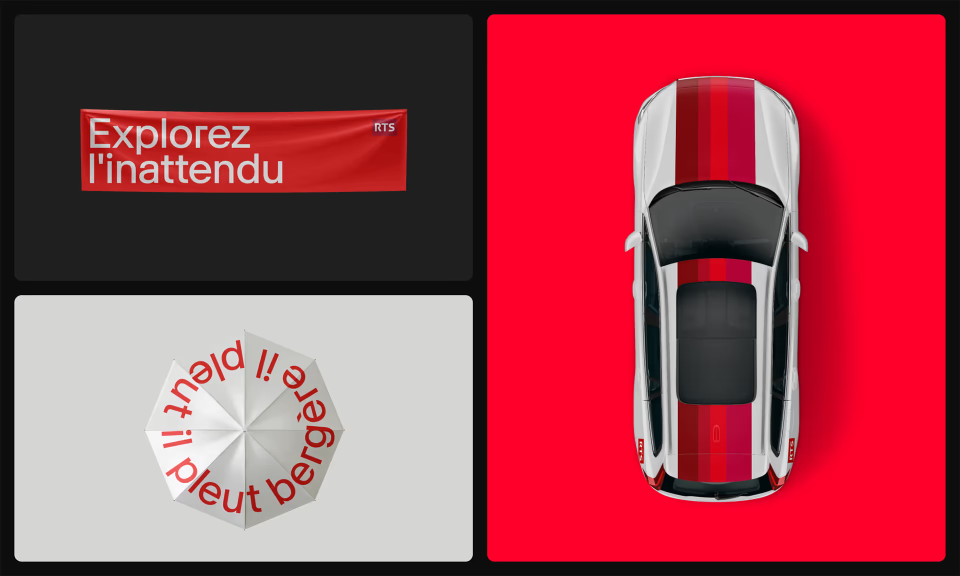
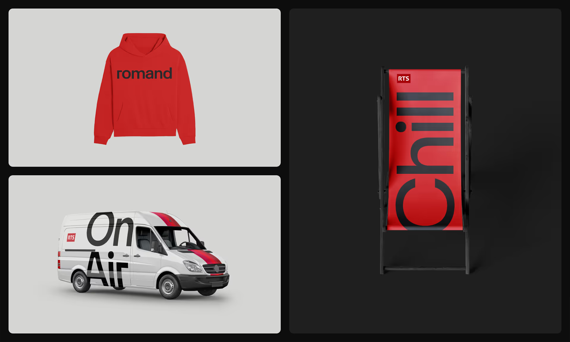
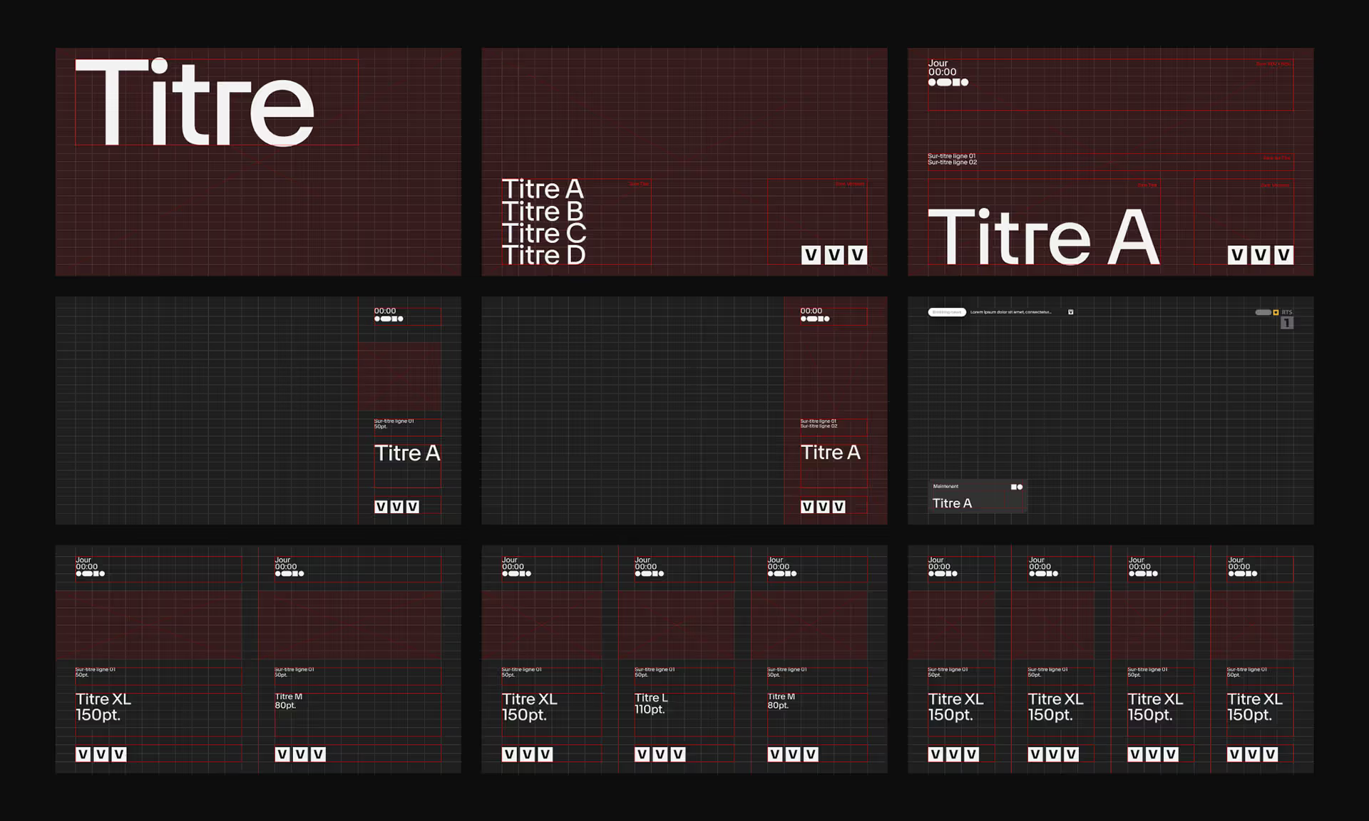
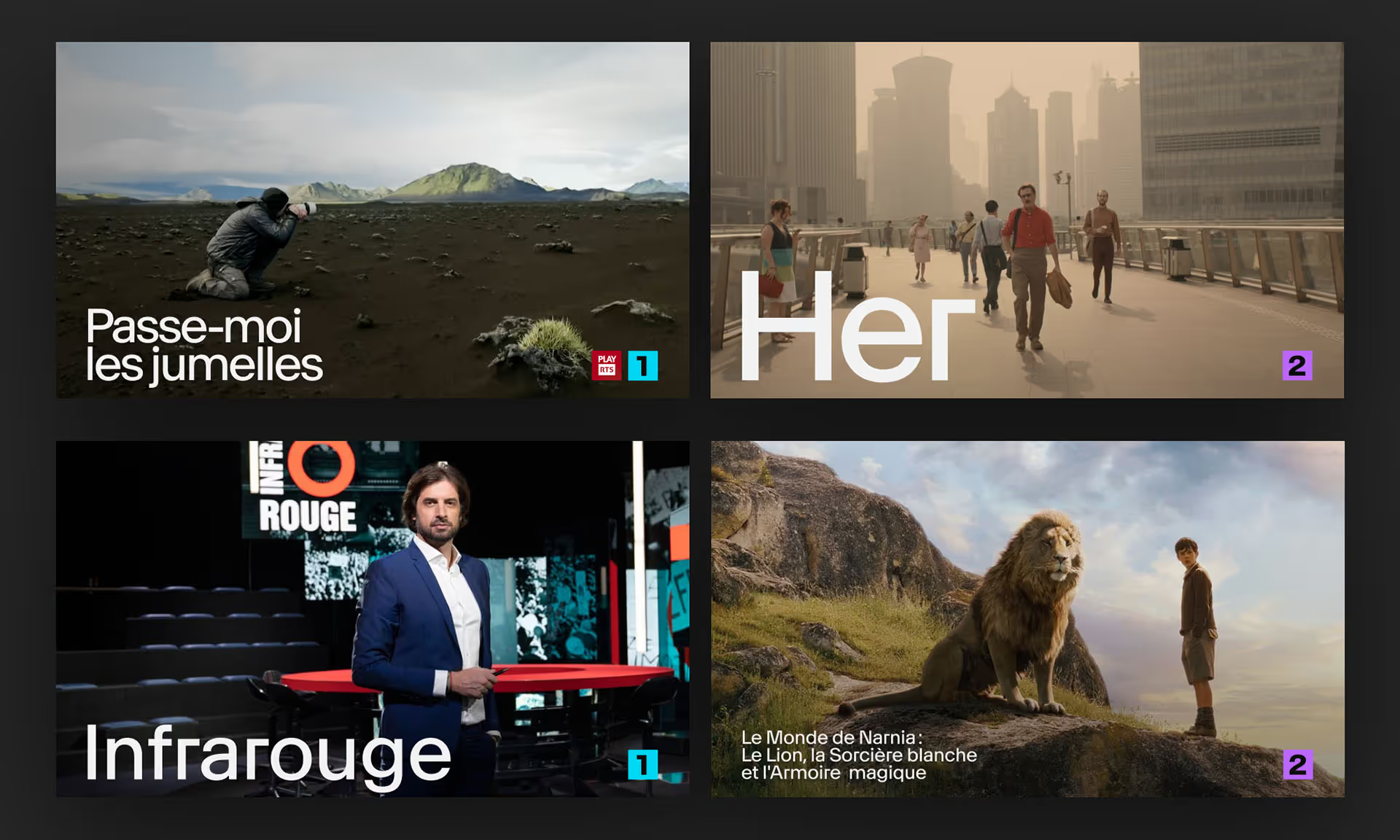
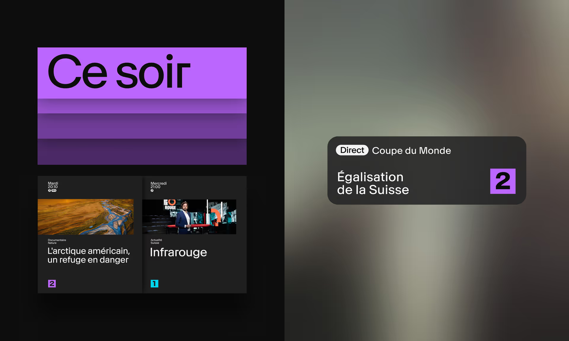
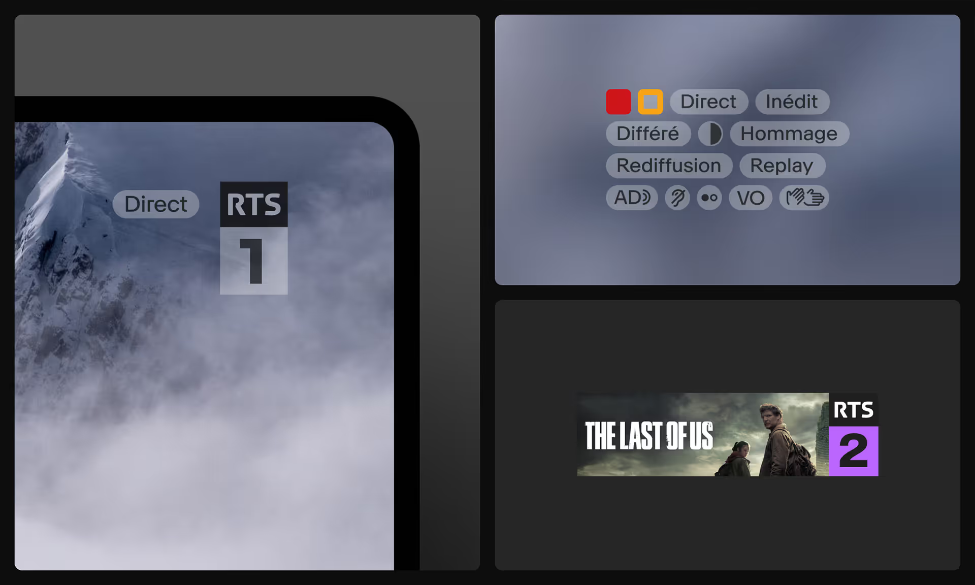
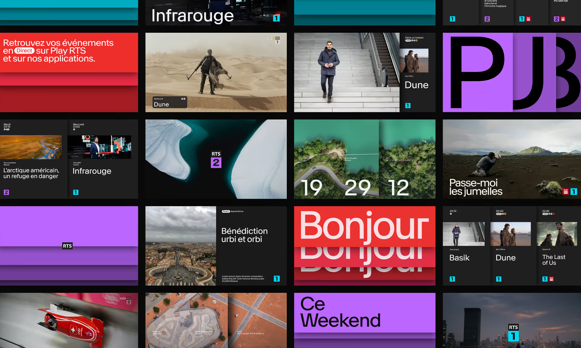
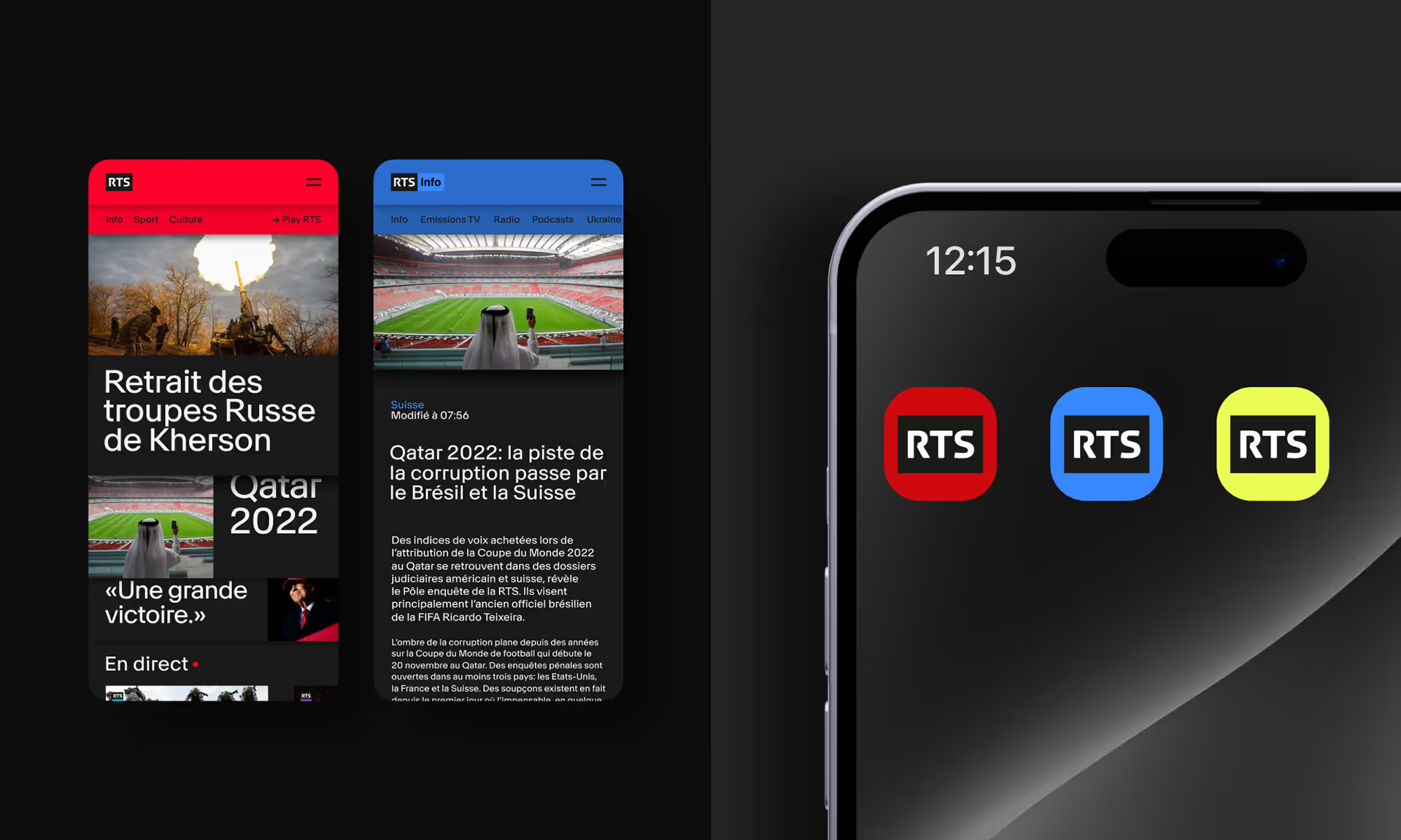
Hymn’s solution allows RTS to express its unique and diverse identity through a simple yet cross-functional concept that revolves around a single element : the RTS logo. But – as is so often the case – that simplicity is the result of a complex, uncompromising, and subtle combination of typography, colour, animation, visual and audio associations, and (perhaps most importantly) dynamic storytelling.
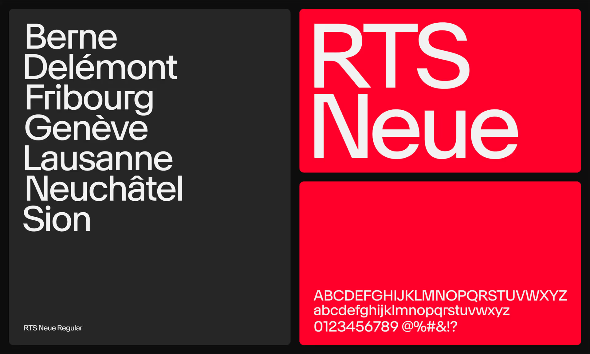
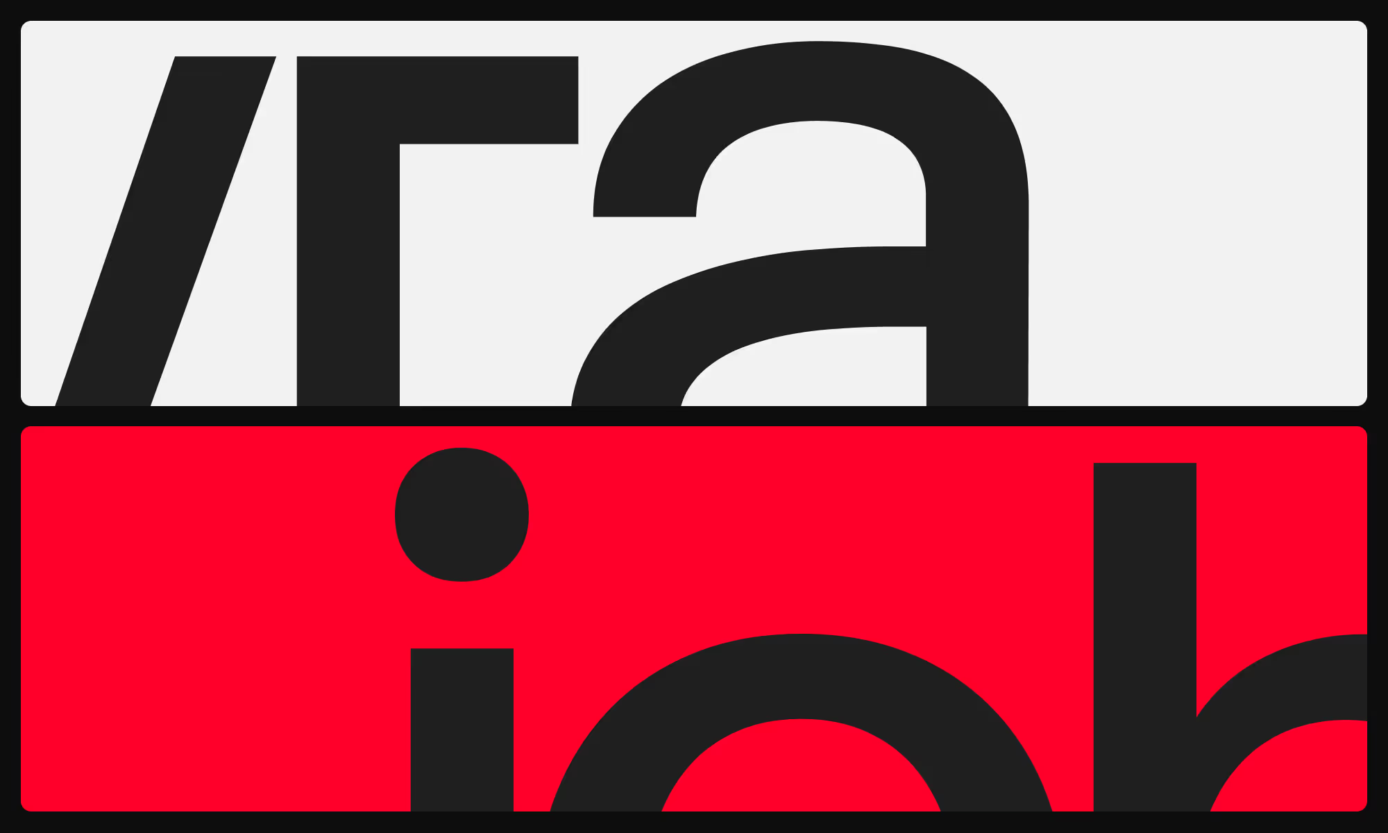
When it comes to the typography, we sought to embrace both the unique and the “industry acceptable”. Through a collaboration with Ian Party (from the Swiss type design studio NewGlyph), we developed RTS Neue, which is as much Swiss-Romand as it is atypical audacity. This typeface was thoroughly studied, dissected, and reassembled, embracing both the rounded and the sharp for ultimate ergonomics in every curve, joint, and angle. The result is well-defined, readable, and easy on the eyes. The colour palette continues that same flow in rich, vibrant reds that work as well on screen as they do out-of-home. The auditory components are bespoke, created by Swiss-Romand composer and interpreter SANDOR to perfectly compliment the other design elements.
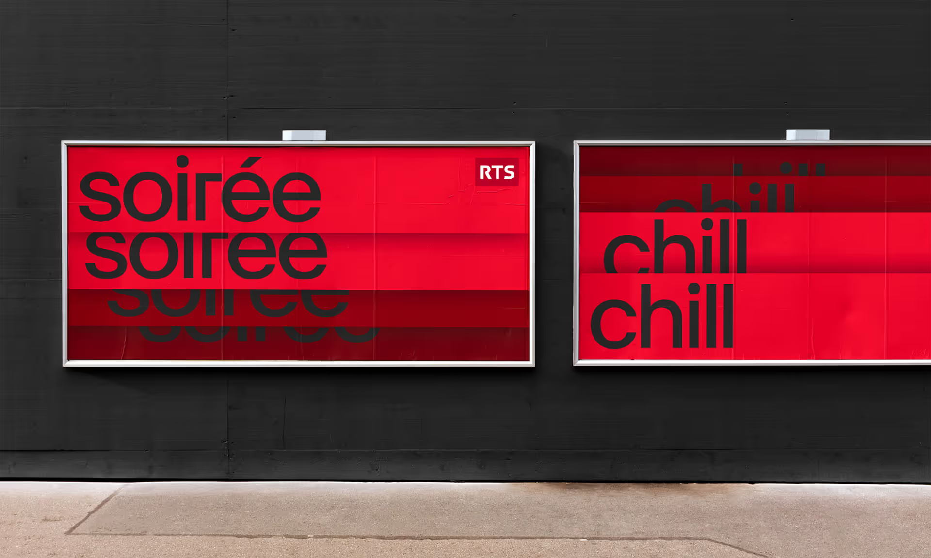
The concept’s taxonomy was the final touch needed to redefine the new brand identity. Built around two strong axes, all content unfolds either vertically or horizontally. The vertical axis represents the channels while the horizontal axis represents the themes, allowing for almost infinite variations within the two layers. The entire concept is instantly readable and echoes the rich diversity of the RTS universe. Like a deck of cards that unfolds from side to side, or from top to bottom, viewers can easily navigate the same concept across both broadcast and digital channels.
Going from theory to final implementation was just a single step... and months of backend iterations. It goes (almost) without saying that the final rollout will take place gradually, given the size and scale of RTS and its many components.

