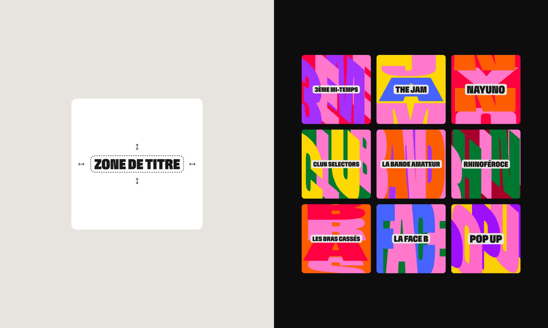
A Fresh and Energetic Mood
Starting with the new RTS brand as a foundation, we built a bright, positive universe for Couleur 3. The RTS Neue typeface is used in an extra bold condensed form to emphasize the station’s strong, assertive character. While pink remains the dominant color, it’s paired with a vibrant palette of lively hues to create a dynamic look.
A Flexible System for a World in Motion
To meet the editorial needs of the station, which highlights emerging Swiss and international artists, the developed graphic system consists of three rounded corner blocks that allow for a wide range of compositions, blending images, text, and color in various ways.
Social Media-Ready
The proposed system doesn’t just give the brand afresh look ; it’s also designed to meet the increasingly digital habits of Couleur 3’s audience. Through motion design, the visuals gain depth and volume, while still keeping a flat design approach that works seamlessly across digital platforms.


