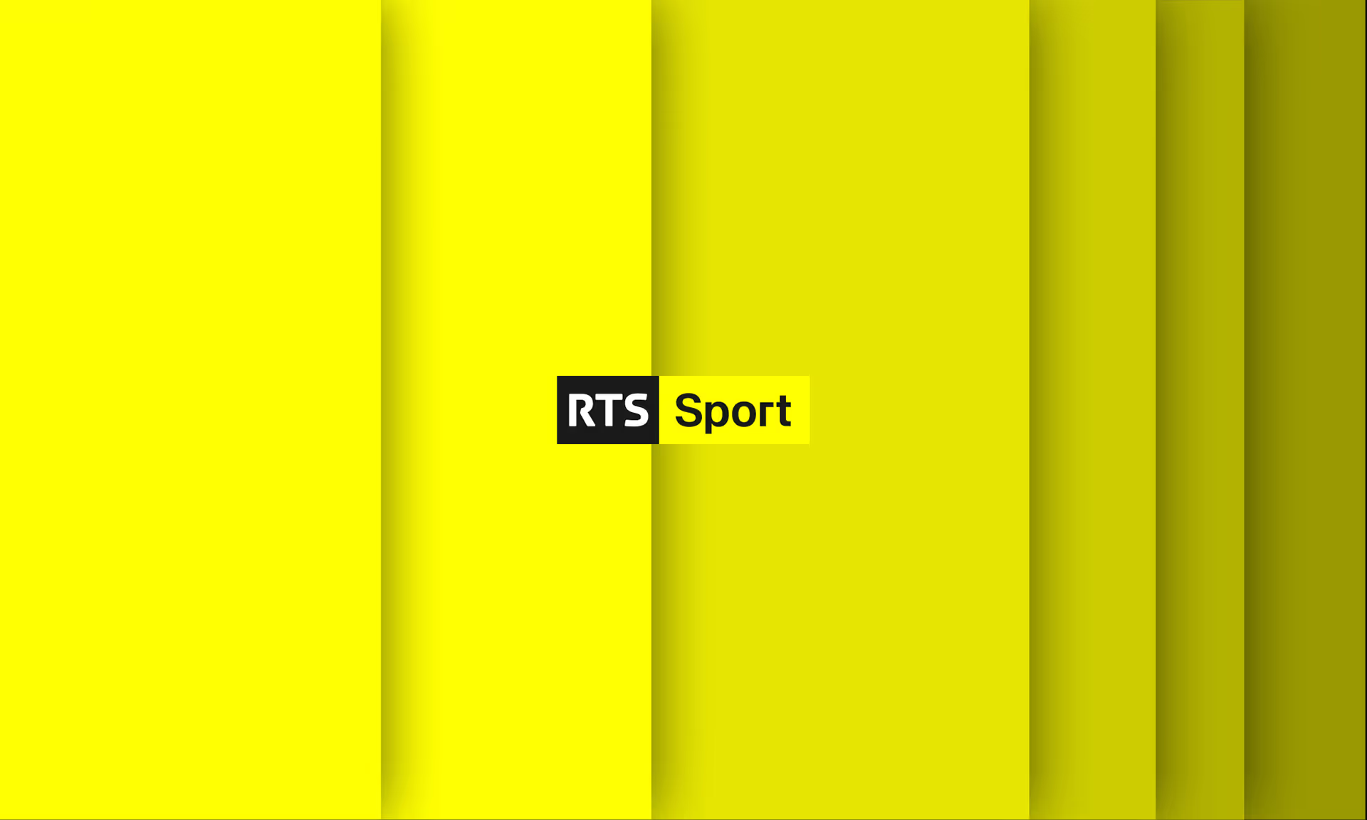
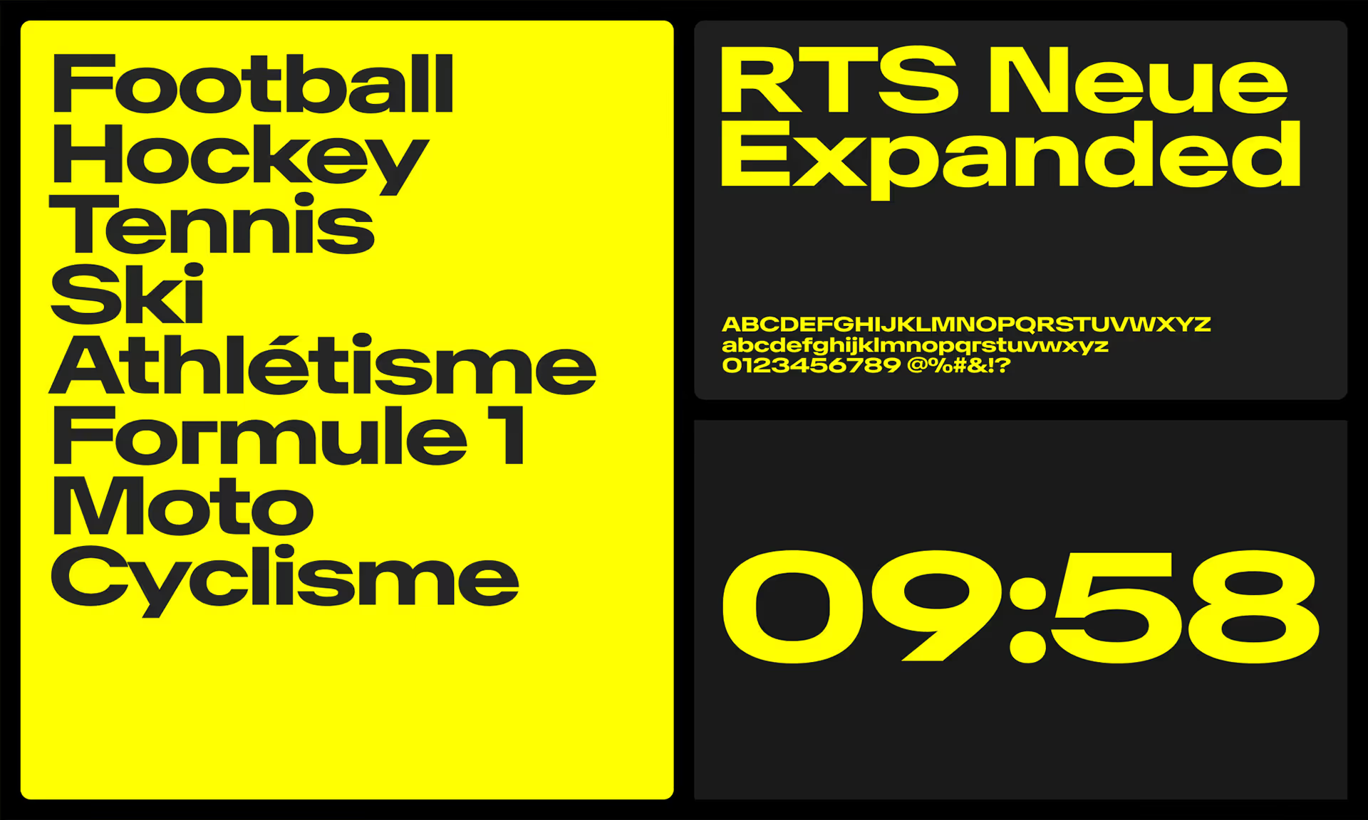
To respond to these challenges, we naturally began our journey with the updated visual code put in place for RTS… with a twist! Our first major decision was in choosing the colour palette. We chose a vibrant, sporty yellow in the place of the outworn blue, grey and red. We also opted to let the new dedicated typeface, RTS Neue, shine in all its glory in “Extra Bold Extended”. Larger and more impactful, the typeface boldly marks its territory and levels the playing field.
Illustrating sports, without favouring any one particular sport, also proved challenging. Our approach was to develop a series of all-black, 3D, sport-inspired objects – like tennis rackets, skis, wheels, shoes, and more – which sweep across the yellow screen, offering a close-up look at their visual details without fully revealing the objects themselves. We also added patterns to the animated loops, which are inspired by movements that reflect the tension, confrontation, thrill, and joy of sports.
Naturally, all of these elements were designed to come to life across different infographics, jingles, and background décor for the studio, while also adapting to each show’s superimposed, on-screen elements that are used for announcements or other teasers.


