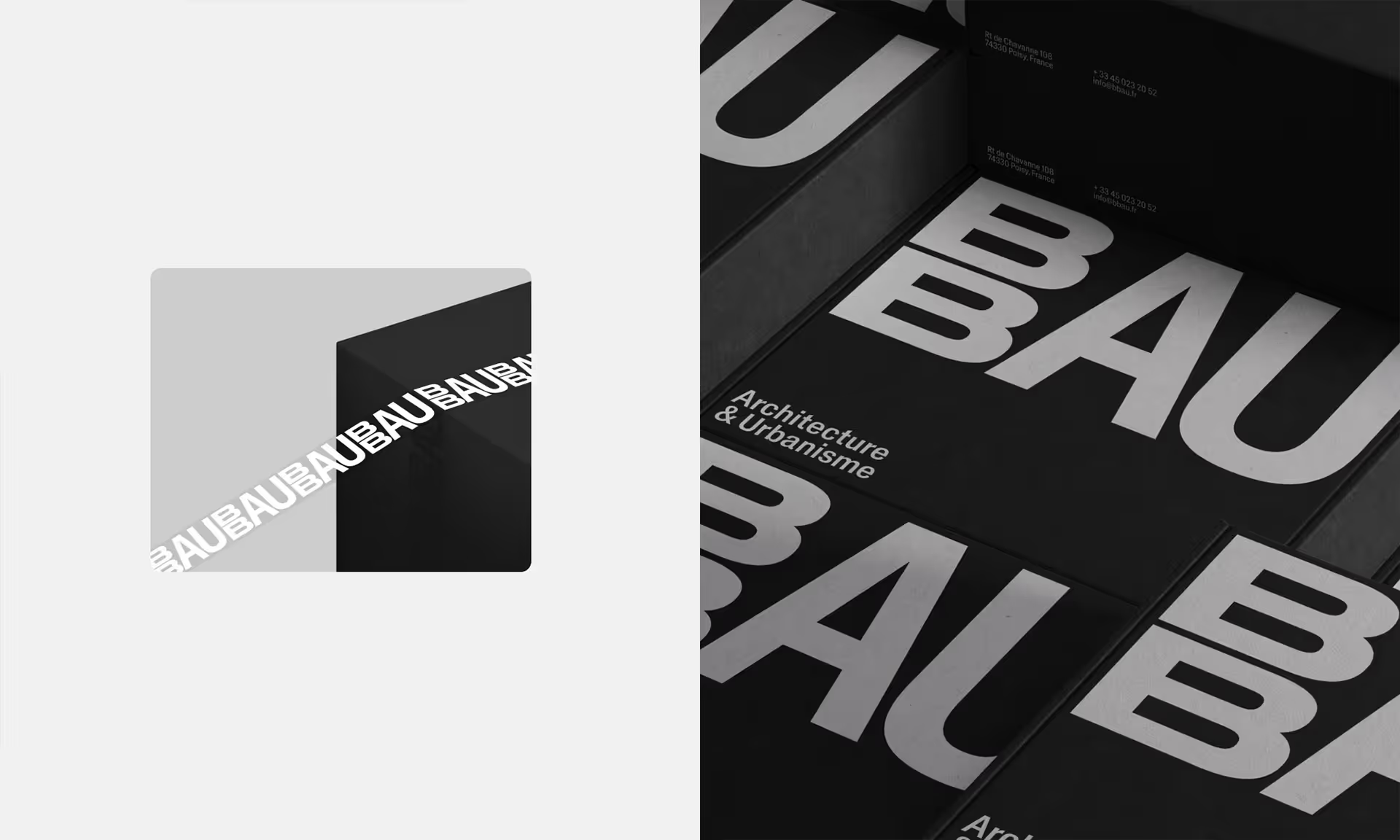
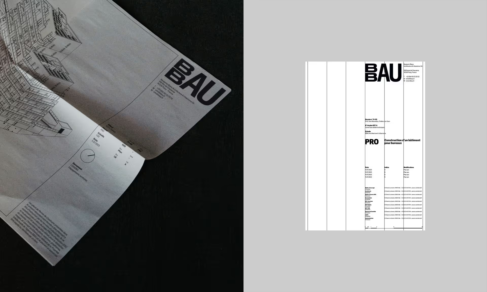
Agency 88 becomes BBAU. Going from two numbers to four letters, which form the acronym for Benjamin Blanc Architecture and Urbanism, was an obvious choice. But when put down on paper, stacked vertically, we were surprised to find that the double “B”s took on a whole new dimension. They are both imposing and impressive. The acronym instantly became much more than a collection of letters. Although only a few centimetres tall, it feels monumental. The simplicity of the superposition gives the new logo volume, power, and modernity, all while harking back to the architectural aesthetic that the firm embodies.
The singularity of the acronym is intensified by the use of a “variable” typeface – a new generation of fonts without explicit distinctions between weights and styles, which can be modified down to the millimetre. La Crystal (designed by NewGlyph) takes cues from Helvetica but goes even further, establishing itself firmly as an excellent choice for years to come.
Per usual, we made sure our proposal was dynamic and could easily adapt to different mediums. For digital channels, we played with the perspective to create 3D effects of animated cubes that rotate and turn to form a closed loop.


