Typography with dual identity
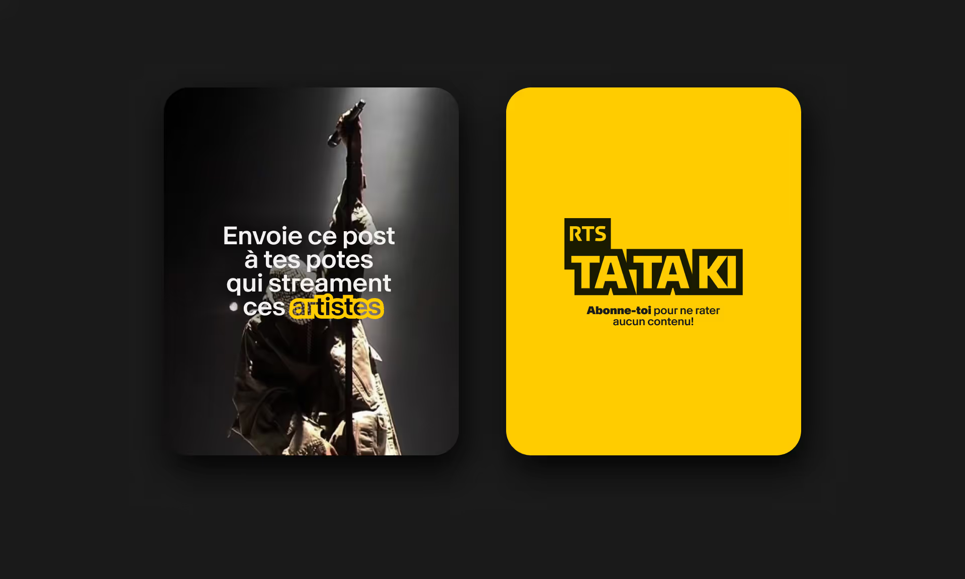
Doing something different while staying the same : a mathematical impossibility ? At first glance, yes. But not if you think... outside the box. With Tataki's new identity, everything happens on the edge, with a creative concept that speaks through the negative space. The brand aligns with the RTS typography but adds a counterform that makes it unique. By varying the form of the word, this outline becomes a strong identity marker. Even better, it allows for rhythmic patterns that work especially well in dynamic formats, like motion design.
New Logo
We completely redesigned Tataki’s logo, connecting it to the RTS visual system by repositioning the RTS box in the top left corner. The family connection is now clear, while Tataki keeps its own unique look and feel.
The streetwear vibe
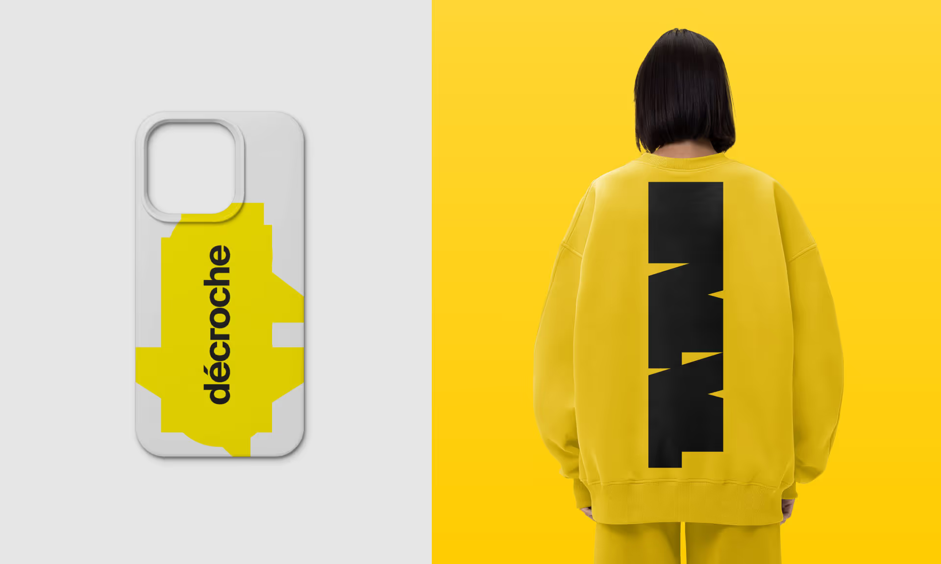
By keeping Tataki’s signature yellow and integrating it into the new universe marked by typographic play and counterforms, the brand adopts a streetwear aesthetic that resonates with its young adult and teen audience.


