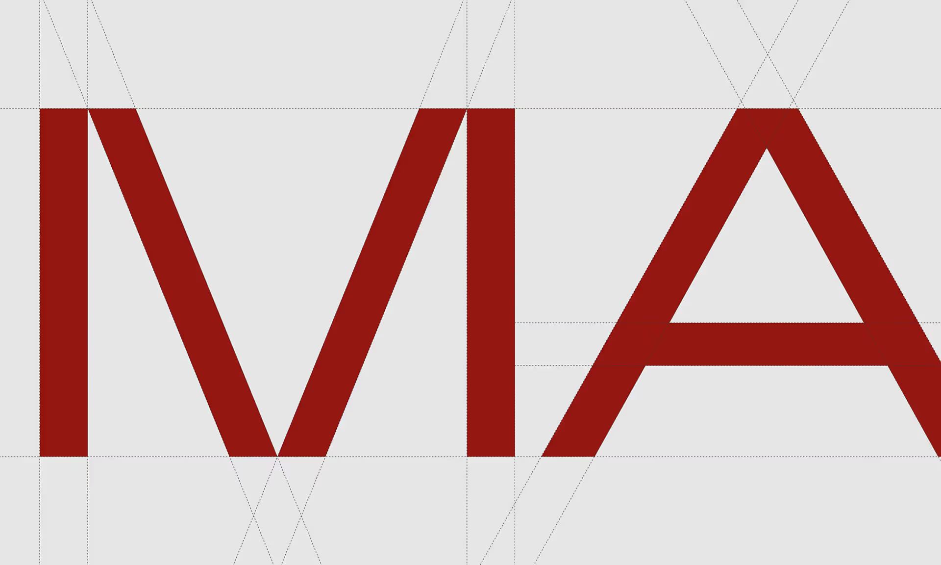
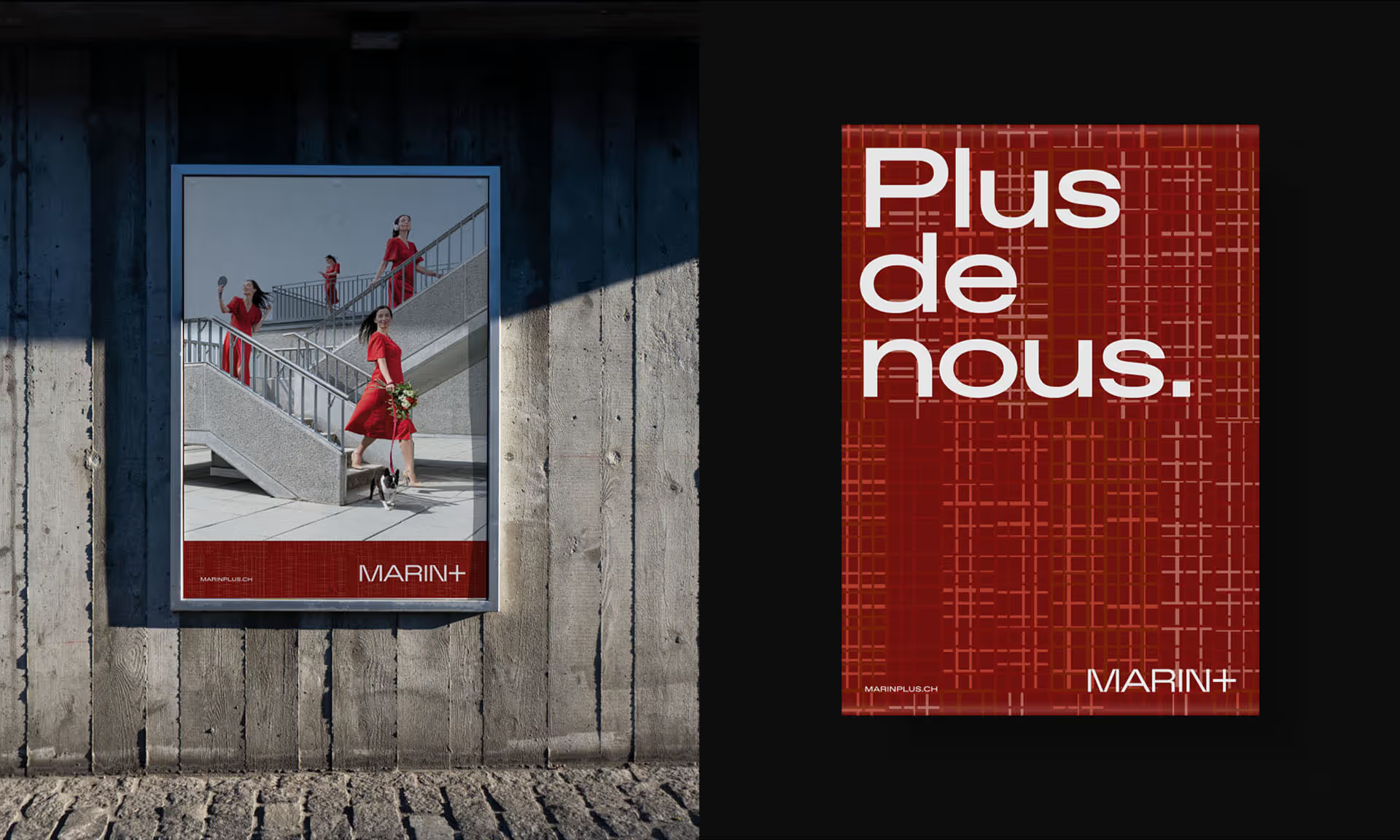
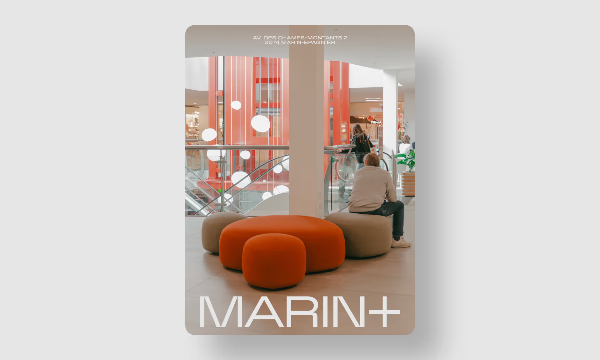
Allow us to introduce the brand-new “Marin+”, which evokes the concept of offering more while remaining faithful to the centre’s original name. It also addressed one of the project’s other big challenges : to find a name that reflects the location (in Marin) while ensuring the centre remained distinct from its large, neighbouring competitor (Marin Centre).
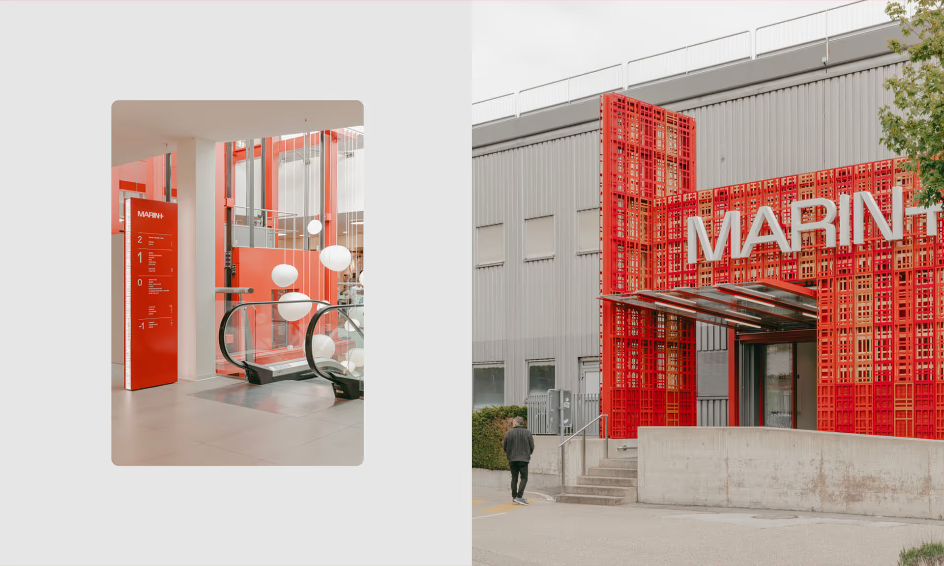
Often thought of as cold and heartless, shopping centres are usually designed to be discreet. We took a different approach and opted to create a universe that boldly asserts its logo and colouring in shades of red and terracotta.
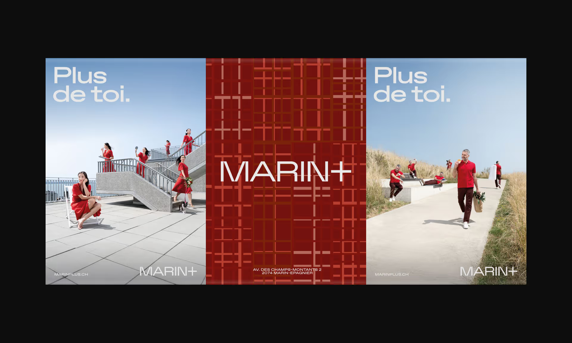
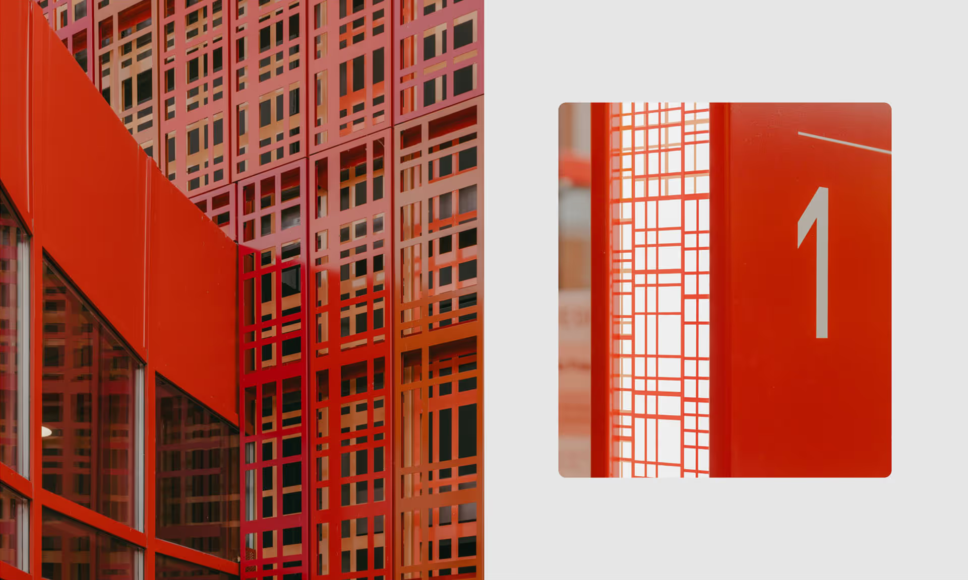
The new identity for Marin+ also included a graphic, woven pattern that results in a captivating and repeating moiré effect. These patterns and colours are at the forefront of the visual identity, the signage and the building’s façade, which were all thoughtfully designed by our team with great care.
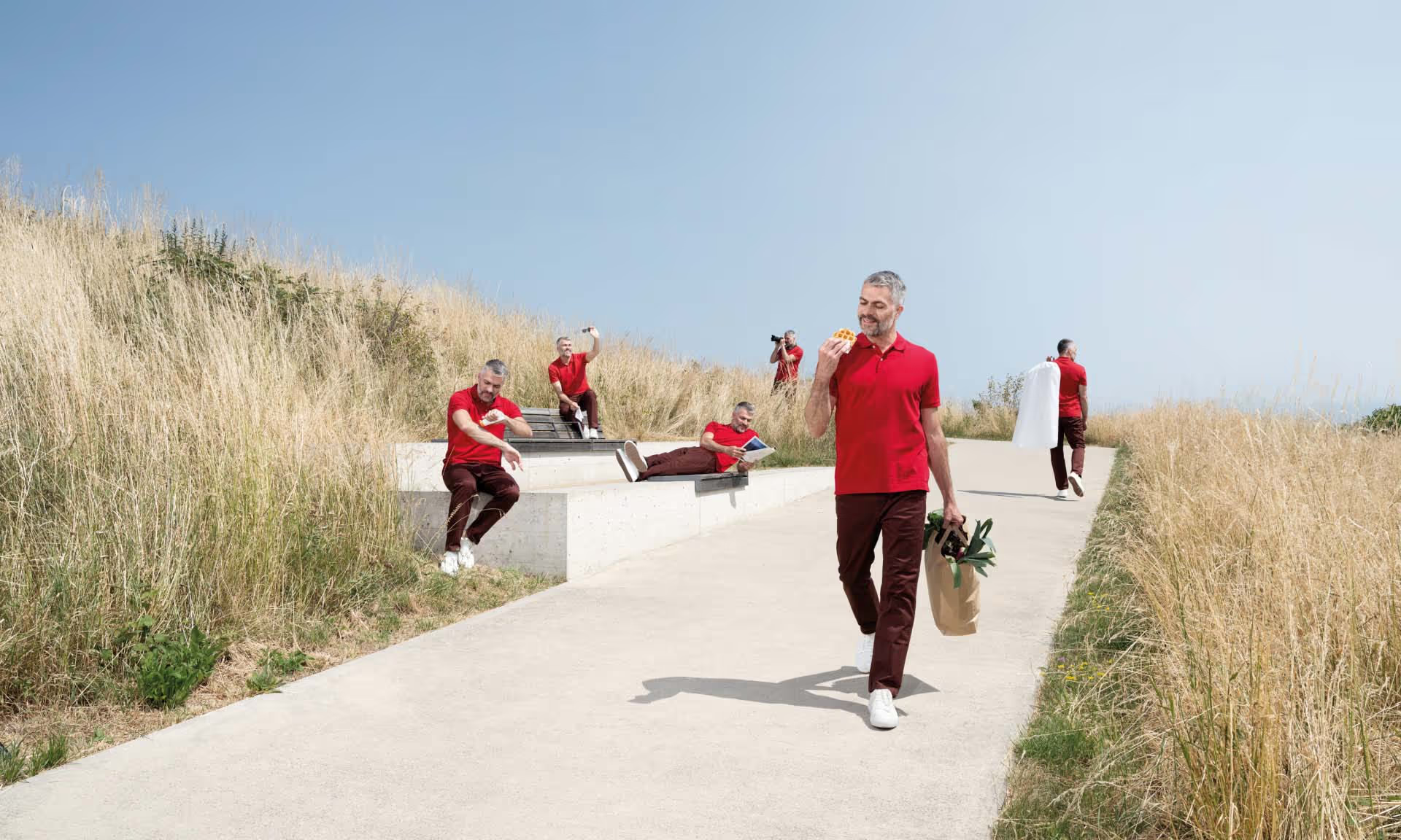
To generate buzz around the reopening, the centre launched a digital campaign. Using the slogan “Plus de toi” (“More for you”), the centre put the client at the forefront, emphasizing both the wide variety of items on offer and the time clients can save by shopping at MARIN+.
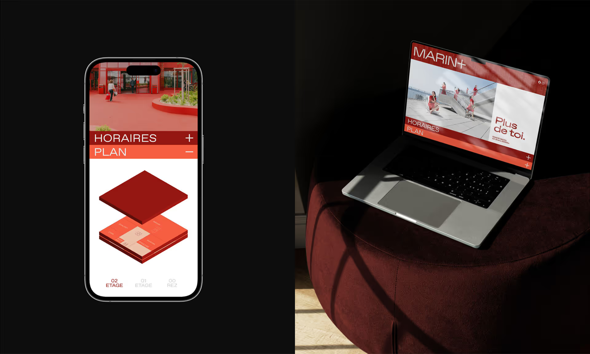
Marin+ also leaned into launching a strong digital presence, offering a first touchpoint for consumers to explore the centre’s brand, personality and offerings.


