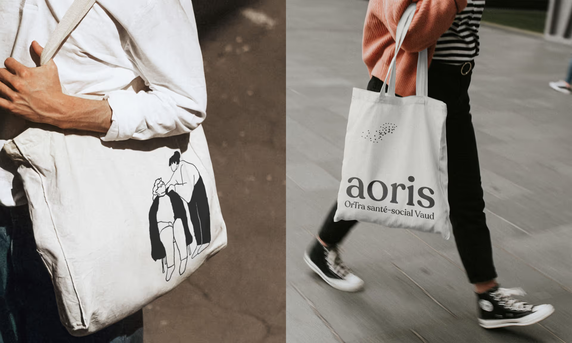
Determining a name for this new platform proved challenging. These industries tend to use acronyms in an effort to be concise, efficient, and unbiased. But merging two acronyms was next to impossible, so we opted to break the mould. We proposed a more ethereal, inspiring name, which was both easy on the ears and easy to remember : “Aoris”.
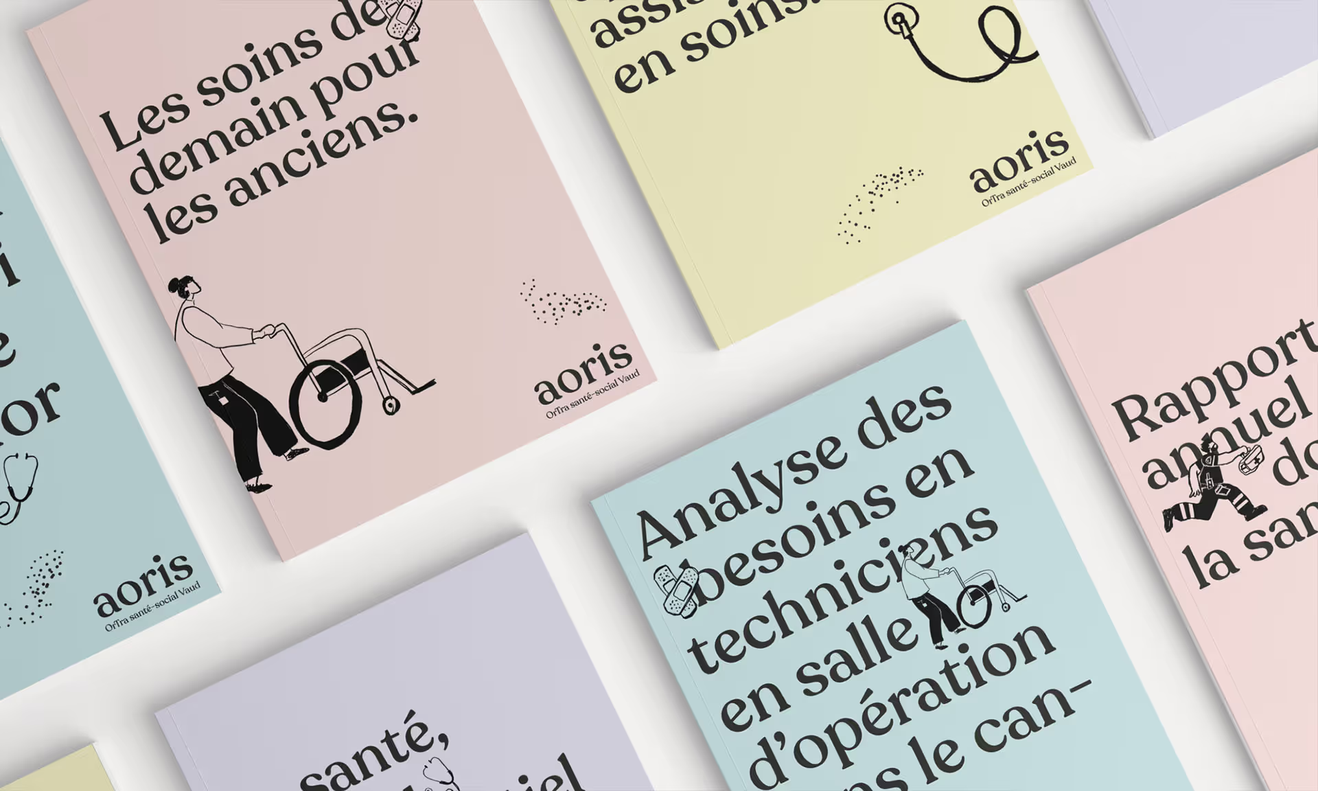
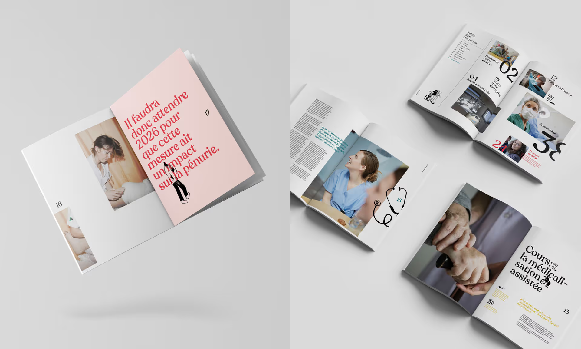
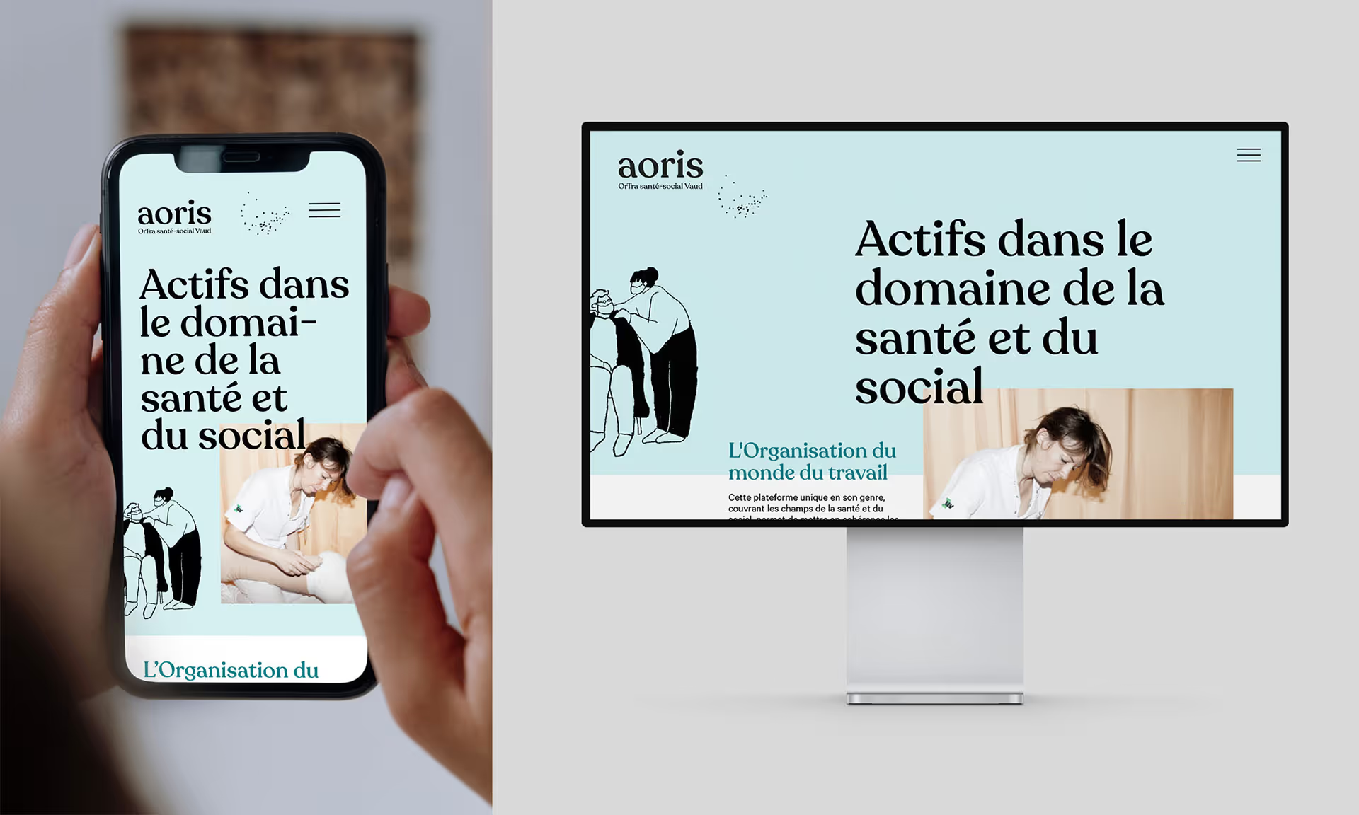
After developing the name, we shifted our attention to the brand’s visual universe. We established various elements that could operate individually and yet also form a cohesive whole, much like the mission of the various stakeholders involved in this project. We used the typeface Recoleta for its softness and generous curves, along with two complimentary colour palettes : one being calming pastels, and another composed of vibrant, zesty colours. We also created a murmuration of birds out of small dots that come and go, inspired by the many moving parts of this community that work together to form a single unit. It’s a constant reminder that Aoris is more than a simple sum of its parts, and that we are always stronger when we work together.
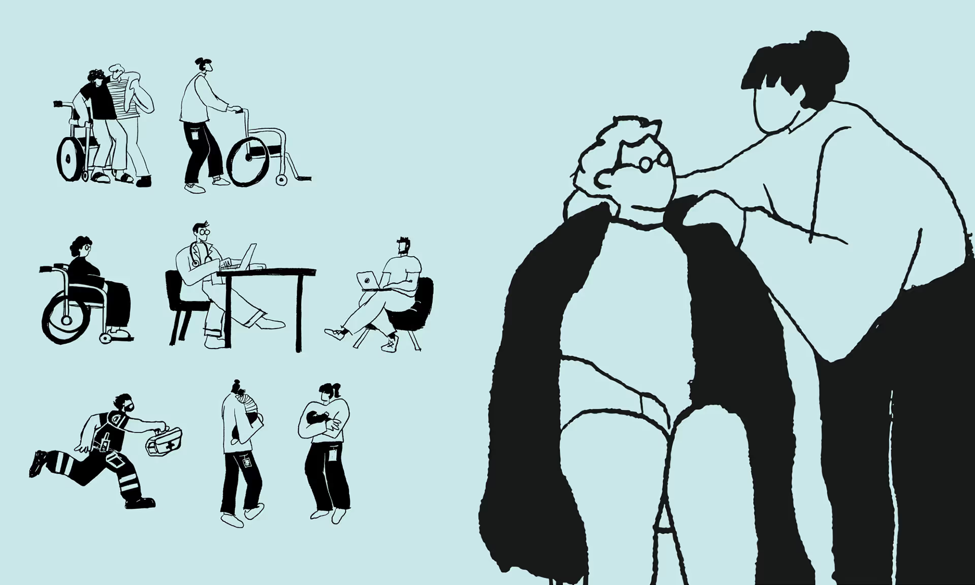
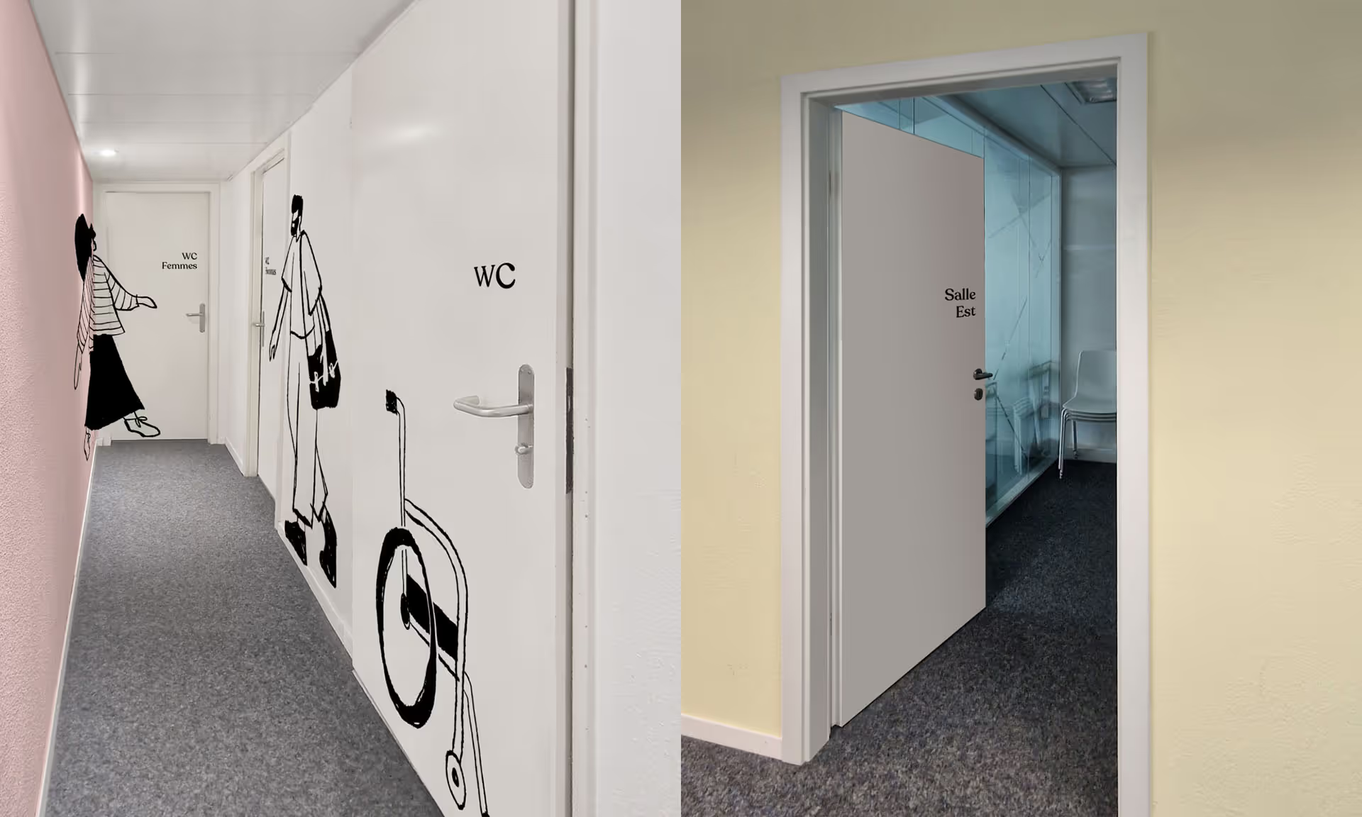
Lastly, we set our sights on the visuals. Given the context of this project, image bank photography was simply not an option, so we opted for illustrations that are intentionally imperfect and imprecise, along with a selection of authentic photography. A far cry from studio work, we sought to reaffirm and reassure by portraying real life, real people, and real industry careers in the chosen images.


