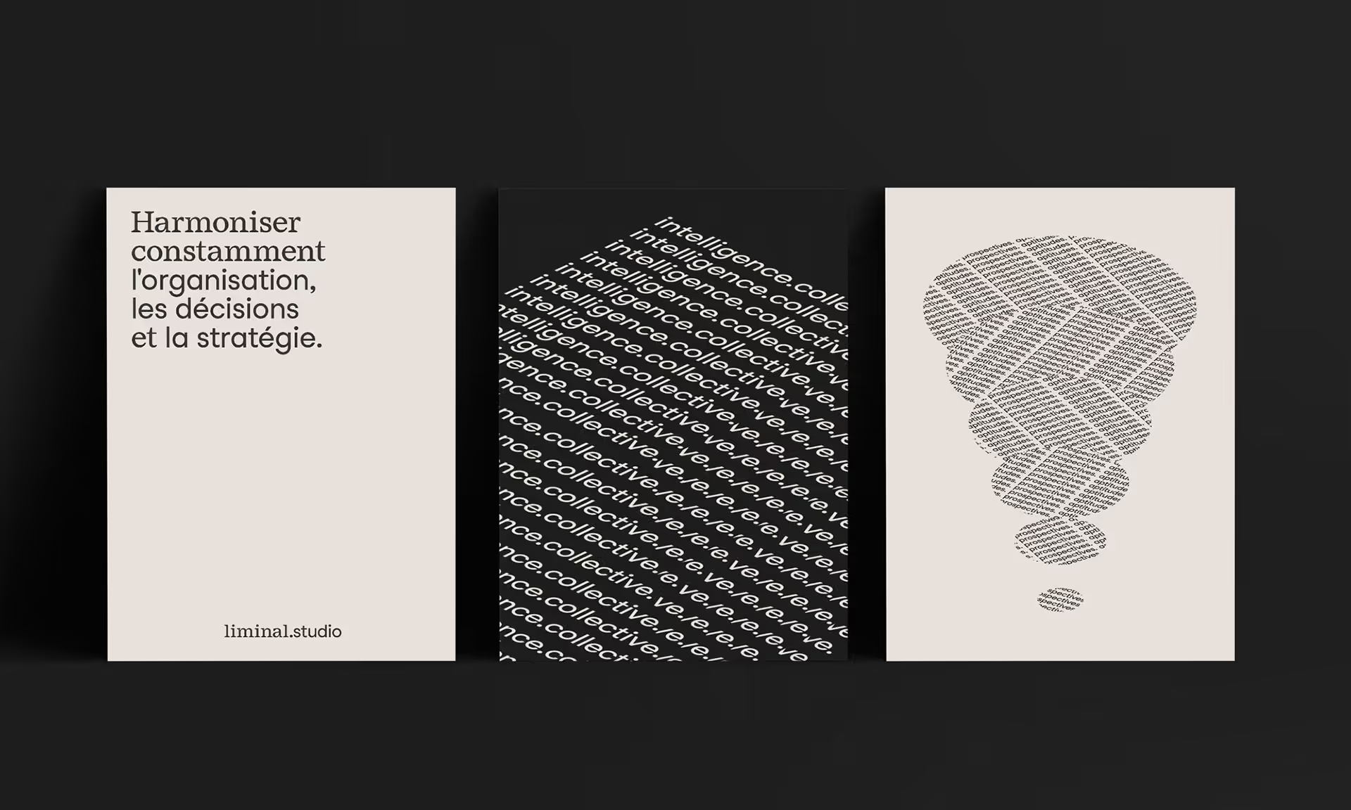
We developed a visual identity that revolved around typography (Studio Feixen Fonts) and colours : we designed symbols inspired by a compass and a stamp – clean, simple, and easily recognizable visuals – and developed a muted and understated colour palette that includes colours like anthracite, sage green and grey linen. We brought the company’s concepts to life through animated typography, designed for both static and dynamic (print and digital) communication materials.


