Working with our friends at Stitzlein Studio, we dove into the Pacific Ocean, as it runs close to the Californian shore and the institution's four locations, to find the heart of our client's new identity. Where ocean meets land, a unique geographical feature comes to life between high tide and low tide. This area is known as the intertidal zone, and it became the inspiration for the new name of the schooling institute : IZZI. Intertidal zones are home to unique communities of plants and animals that prosper in this "in between", as the water rushes in and out. Working together, these communities ride the waves of life to thrive, much like our client does on a daily basis through the work they do in their local community.
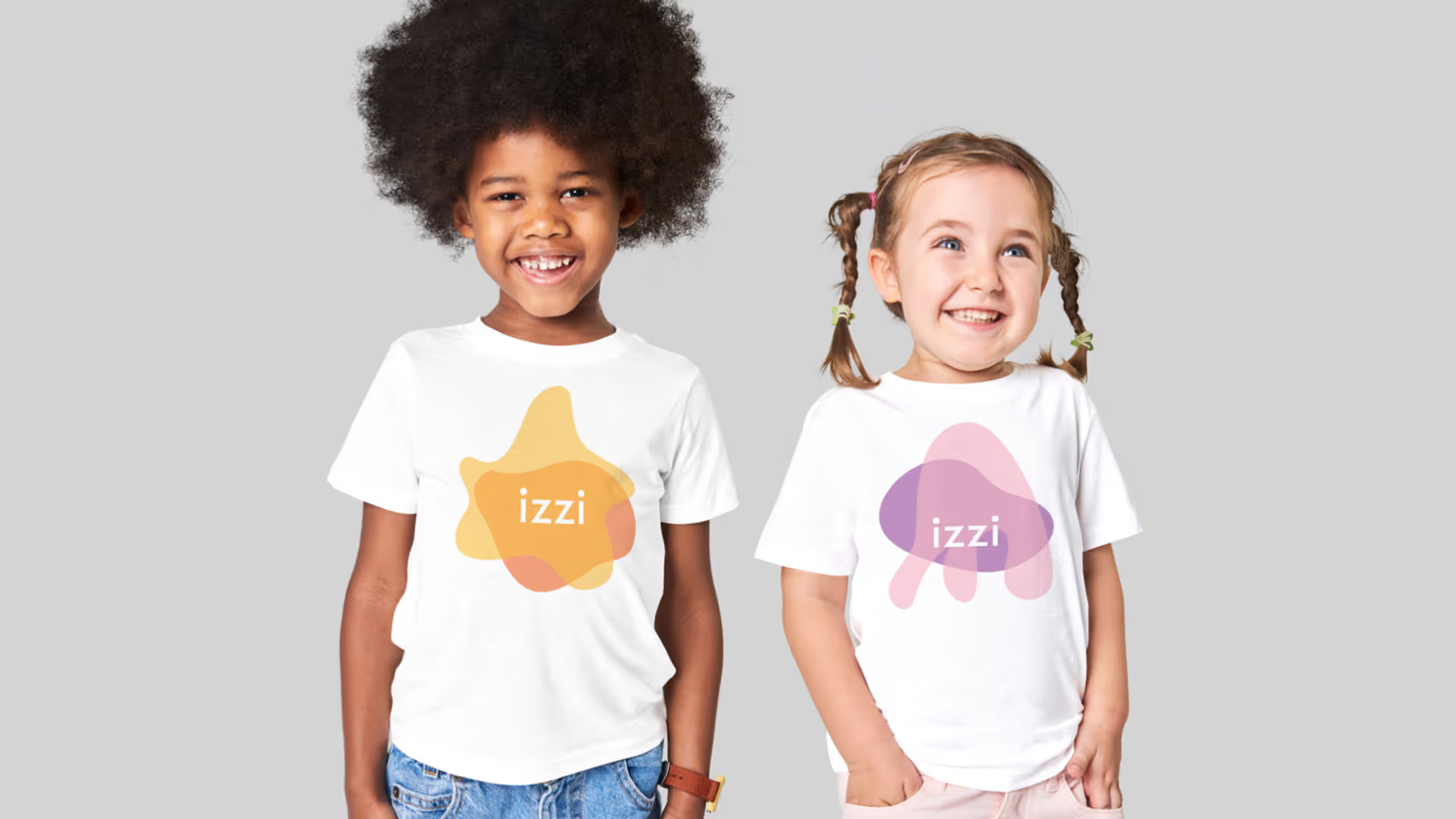
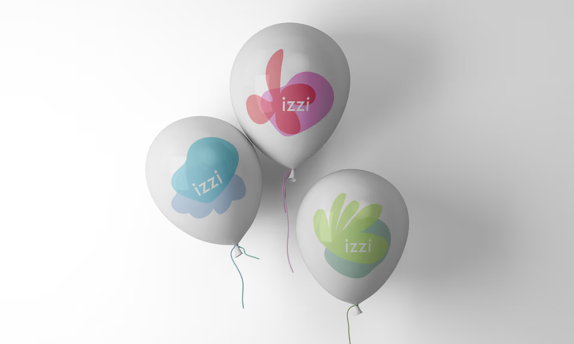
Rather than create a single logo, we opted to create a family of six logos featuring different marine creatures. This choice reflected the magical world that IZZI's children, families and educators create as they work towards their common goal. These logos reflect the diversity and vitality of the IZZI community, as they are all created equal and can be used interchangeably.
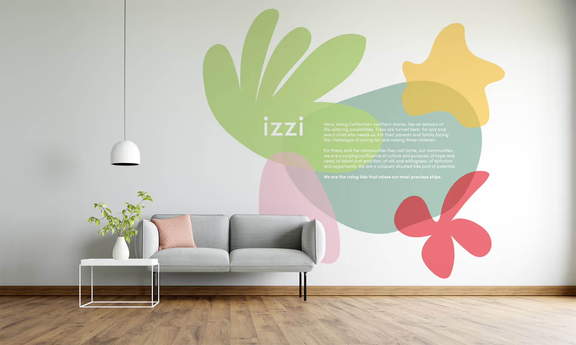
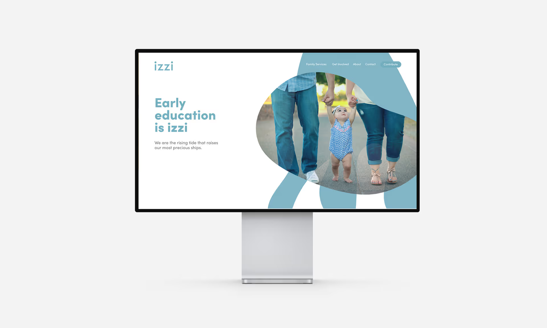
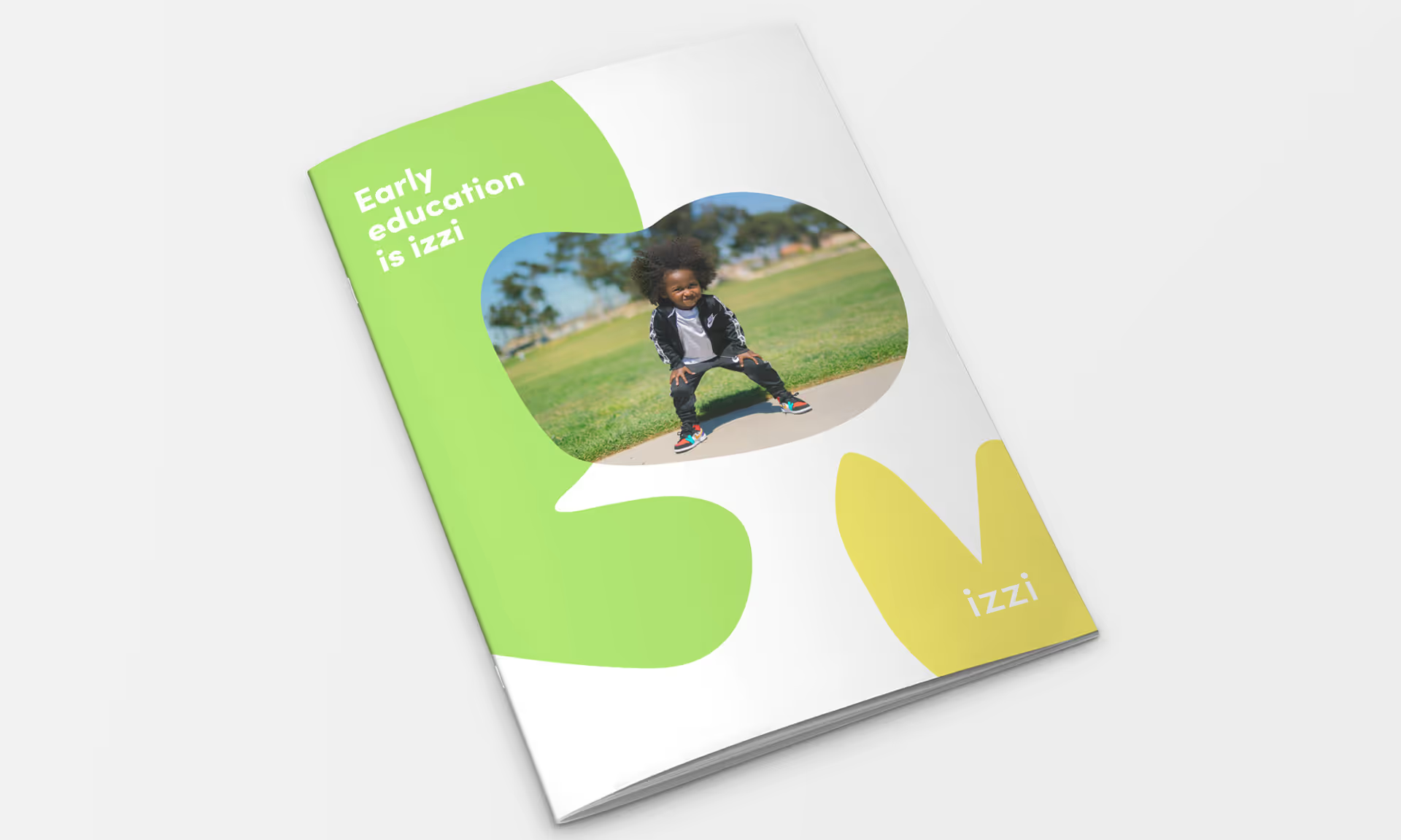
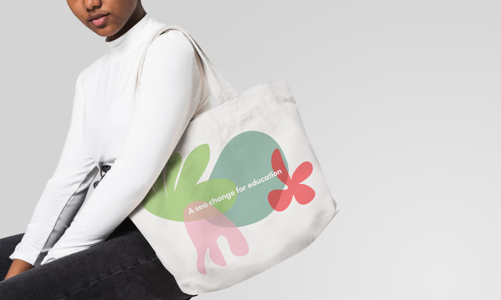
The simple and friendly name IZZI, its colorful family of logos, and its new, gentle typography give the educational institute a fresh brand identity that embraces its core values and the wonder of childhood. The designs were adapted for use on the company's website, for print in its brochures, for signage, and beyond.
