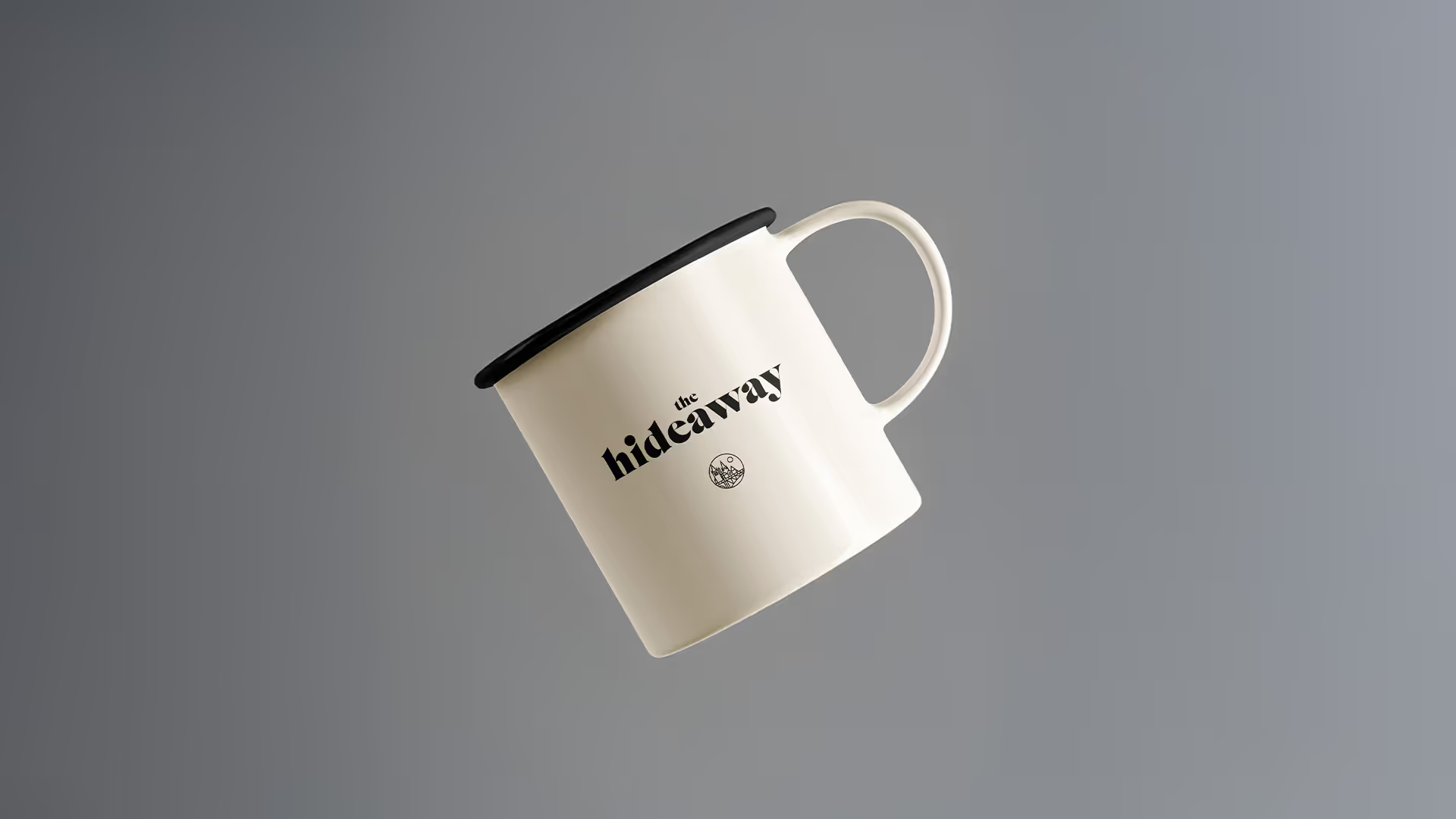
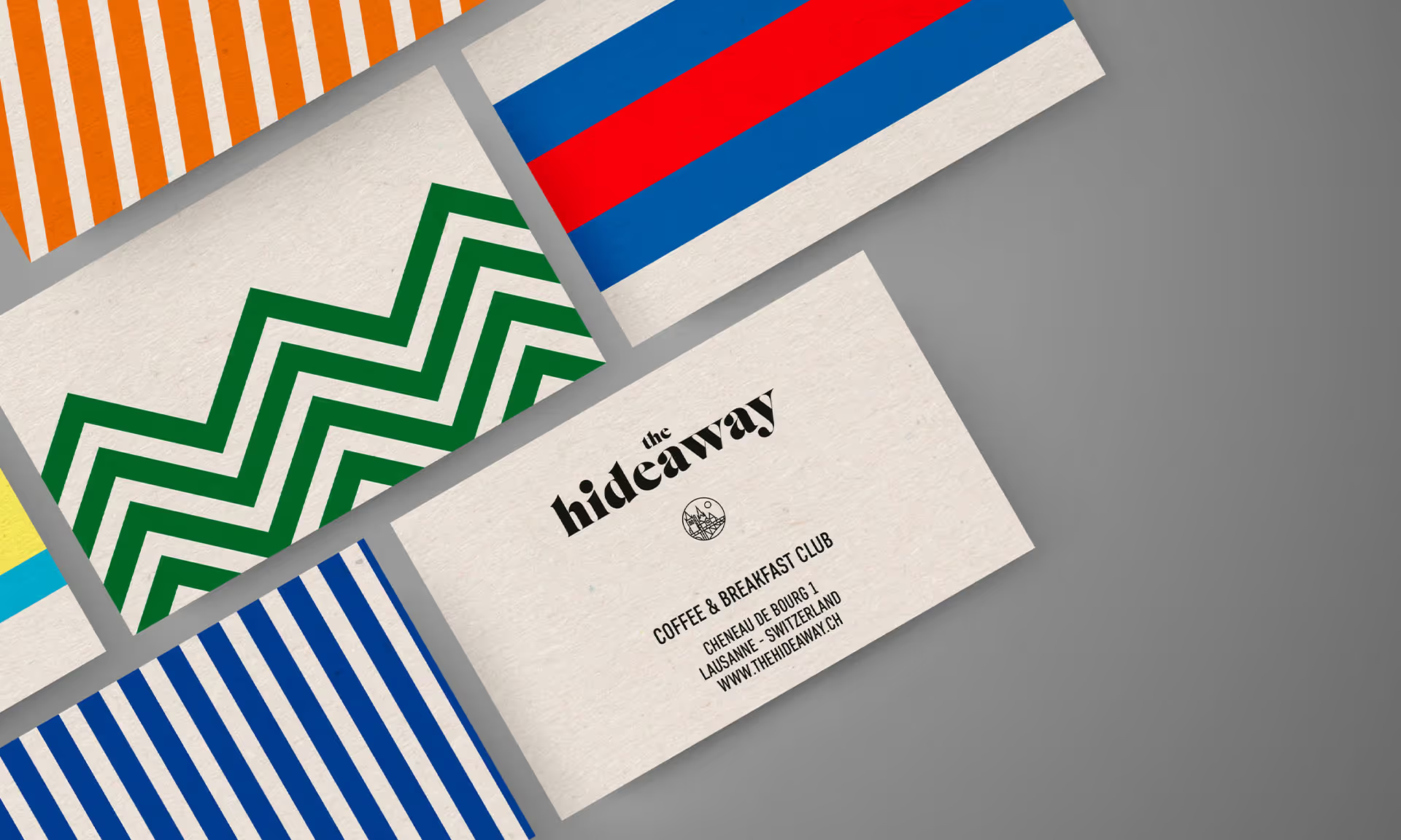
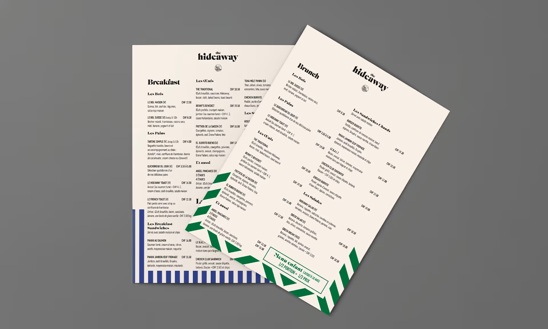
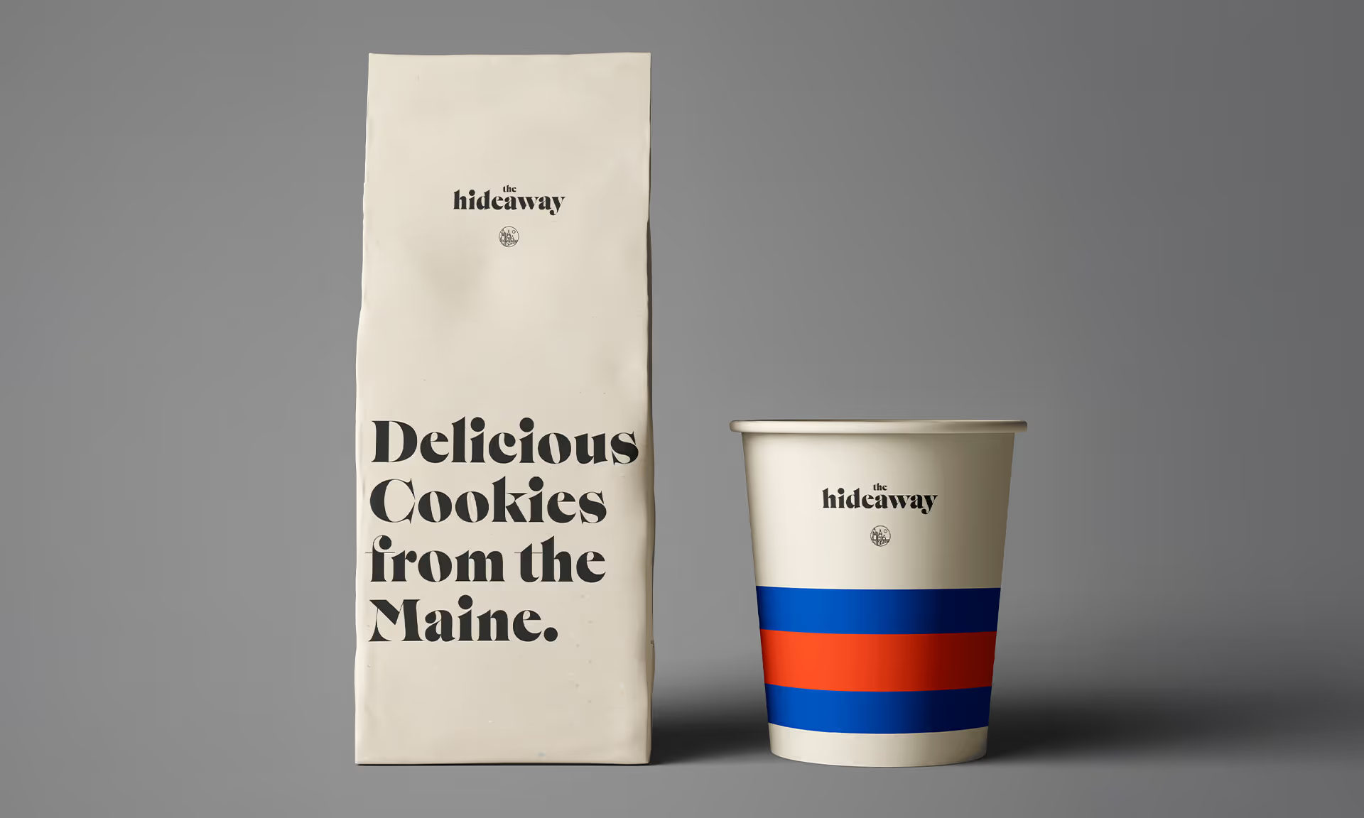
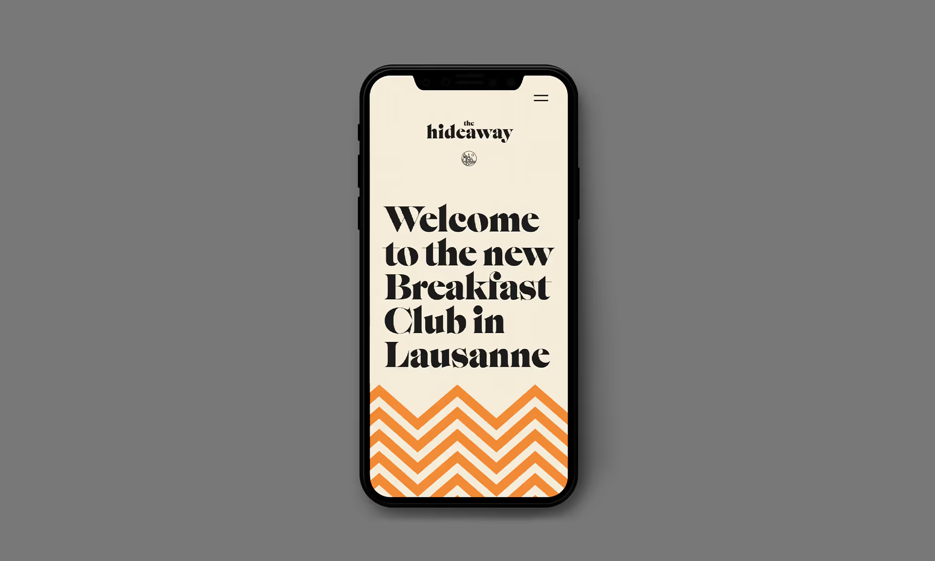
We began our work with the very word “Hideaway”, drawing inspiration from golden 1960s and 70s elite youth lodges and retreats across the United States. Our research took us to all four corners of the country, from a lodge in Lake Tahoe to a Pool House in Palm Springs. We chose a flexible, retro-inspired font by type design company SwissTypefaces and created a medallion to represent the Lausanne-based club.Graphic icons, referencing quintessential locations like the Hamptons and the Florida Keys, were created to embellish club materials like postcards and menus, and we used warm, bright, and comforting colors that would be as soothing to the soul as that first cup of morning coffee.
