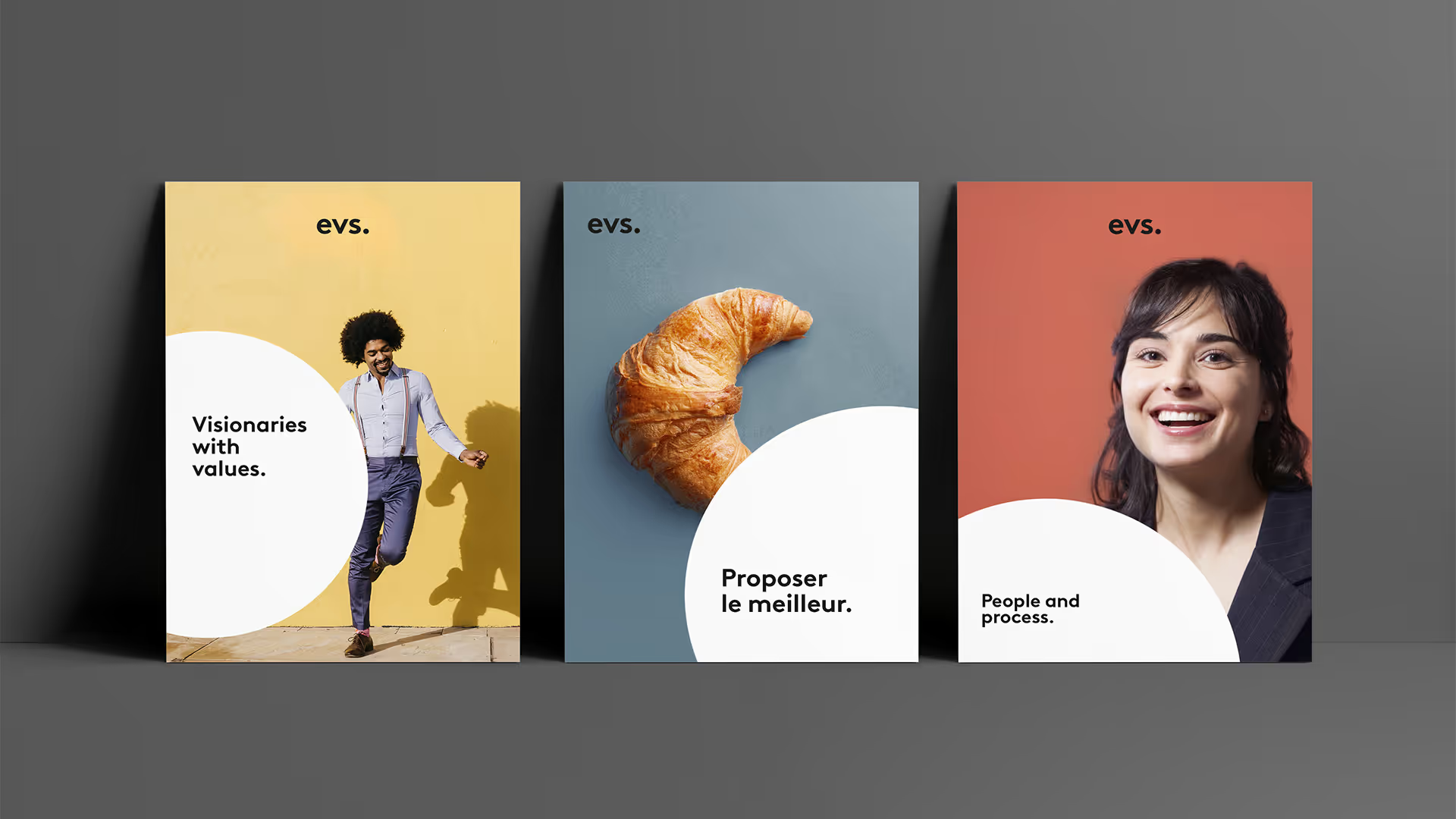
Using universally shared values as our starting point, we created a strong and unifying visual identity and a graphic system that transforms EVS into a human, optimistic, creative, simple and smart brand. The logo embodies this simplicity while remaining both assertive and timeless. The chosen typography, BrownPro, which was designed by Swiss typographer Aurèle Sack, is reminiscent of Helvetica but features a more pronounced and rounded style. That roundness is further enhanced by a period that plays a key role in our new graphic system. That dot represents the center, the globe, perfection in our day-to-day, optimism (like the sun) and a global approach.
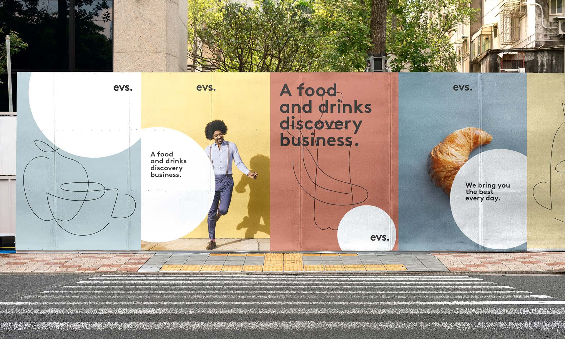
We also developed rigorous new iconography and photography guidelines. Colored backgrounds embrace the ideas of simplicity, optimism, and well-being, while highlighting the featured people or objects in a minimalist way. We also created a series of custom drawings, our "Pencil strokes", which are non-pretentious, single line drawings. All of these elements adhere to a creative, simple and human approach, just like the brand itself.
We applied this new graphic system to all of EVS' communication channels and materials, and developed a complete and updated Brand Bible.


