We developed a “reflections” concept that revolves around water’s literal reflections, in addition to the concept of self-reflection of our consumption patterns and their corresponding repercussions.
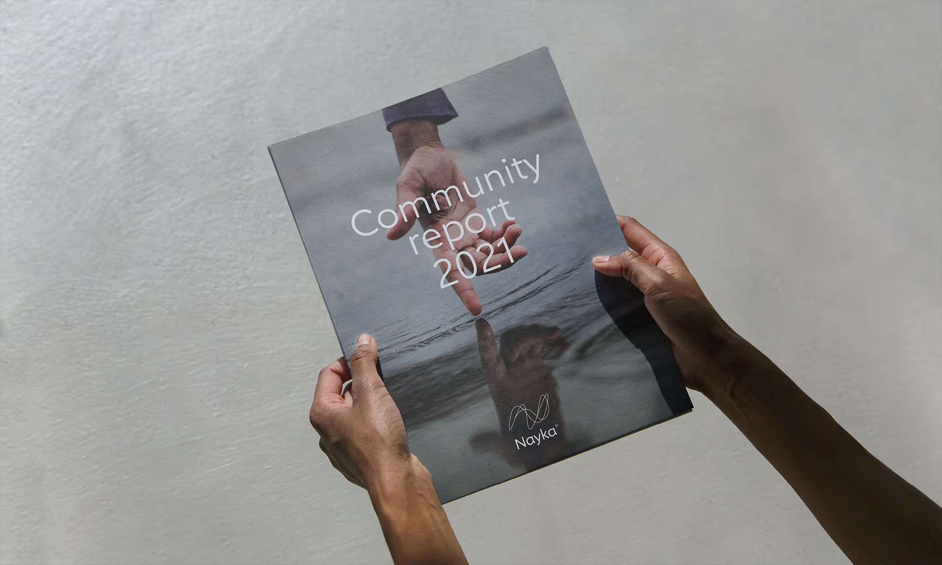
Since we couldn’t use the typically inspiring images of water sources, we chose to work with reflections in water and the magical projections they create when they interact with light. This allowed us to highlight the portability of tap water fluidly and poetically, brought to life in a mirrored reflection on a city cobblestone, across a smooth office desk, or sparkling on the cheek of a loved one.
This intellectual approach to the product enabled us to gracefully introduce the notion of responsible consumption, all while clearly differentiating Nayka from traditional water brand messaging.
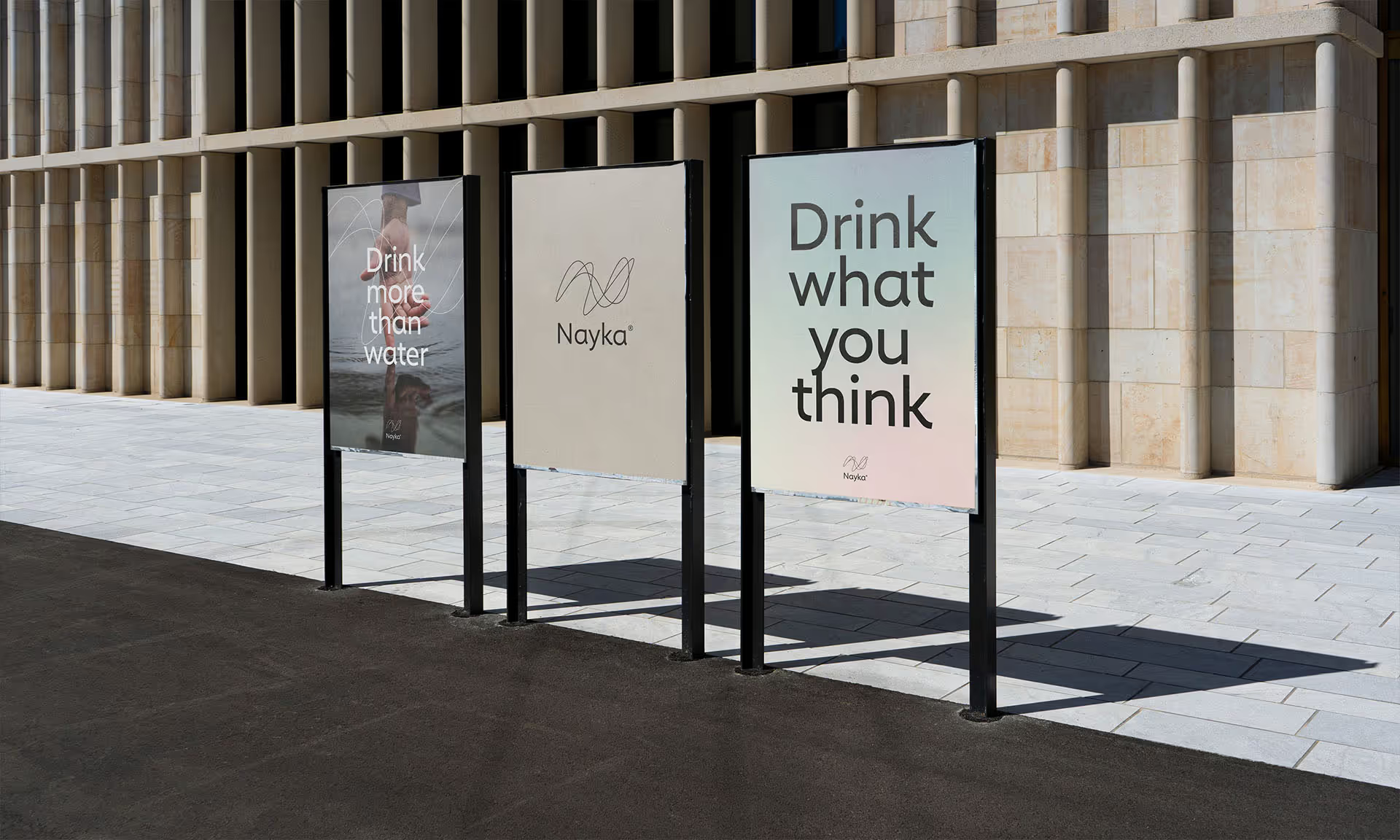
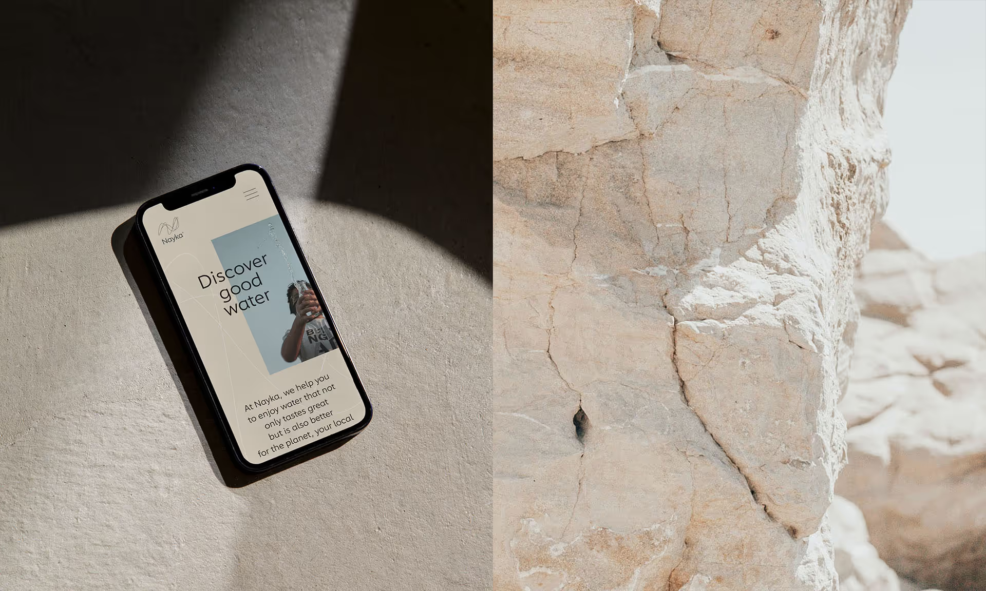
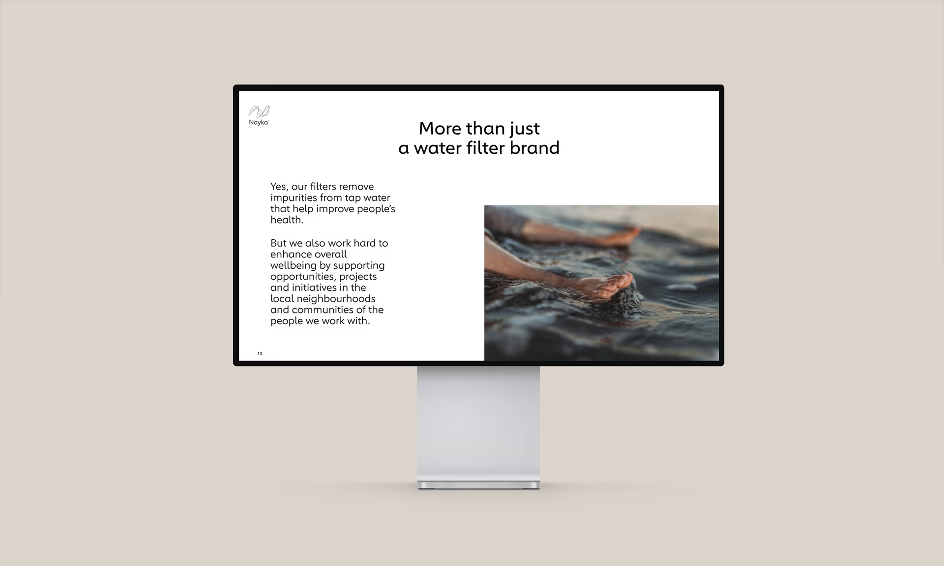
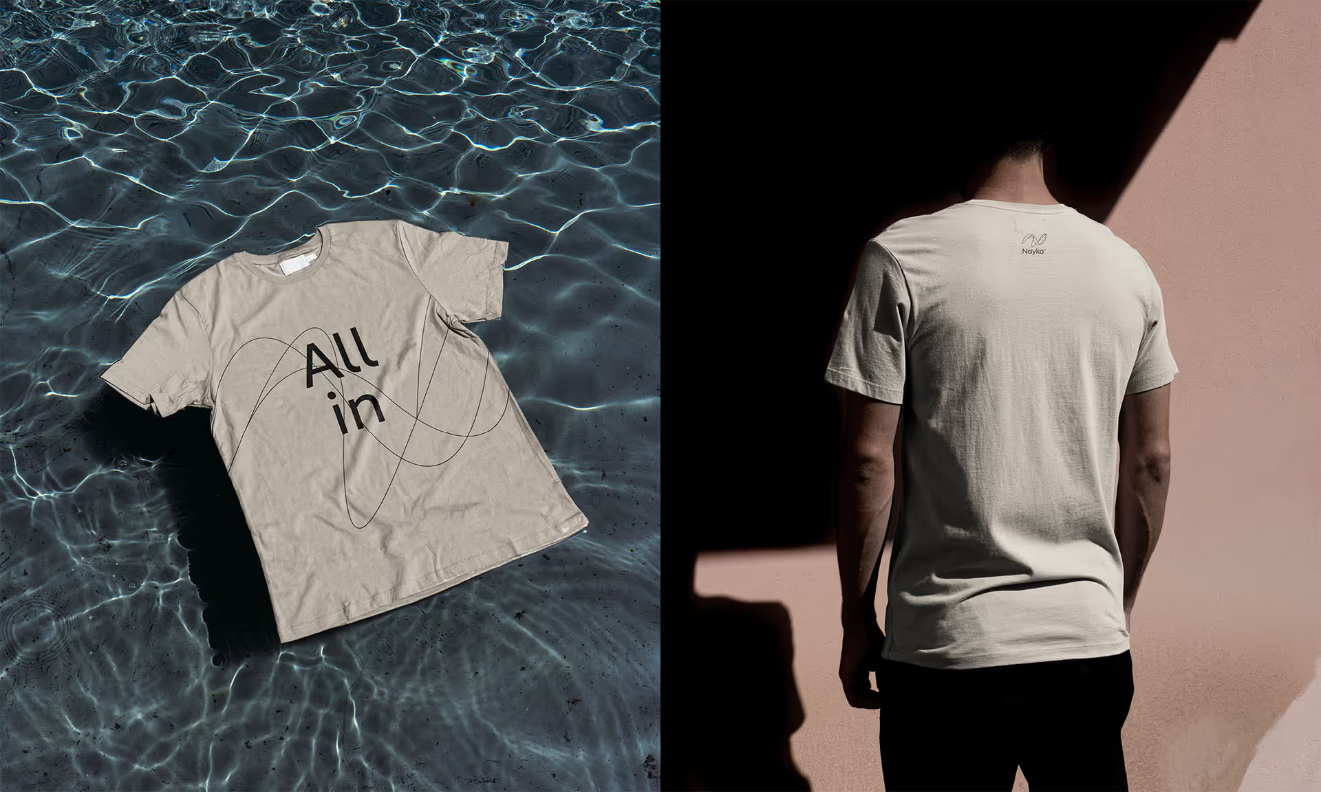
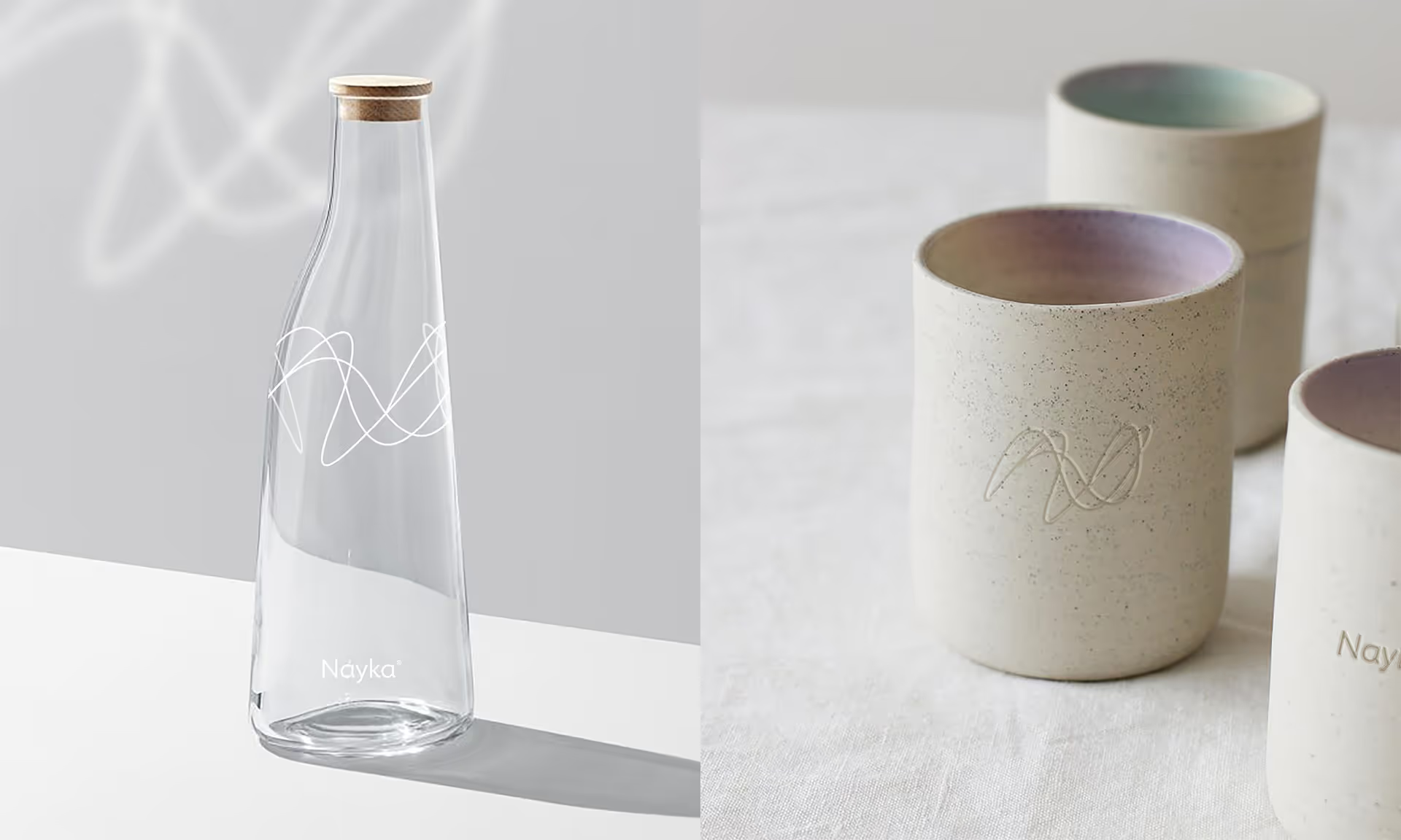
The visuals we developed further support our chosen philosophy. The logo illustrates the “N” in Nayka fluidly, as if through multiple reflections in water. This fluidity is carried through the chosen font, which is simultaneously soft and assertive. The colours and textures that make up Nayka’s visual universe are inspired by nature’s minerality, with references to the ruggedness of the earth, its clay, and its stone. The messaging ripples between the projects Nayka supports and the benefits of consuming water that’s different, healthy, respectful, and sustainable.
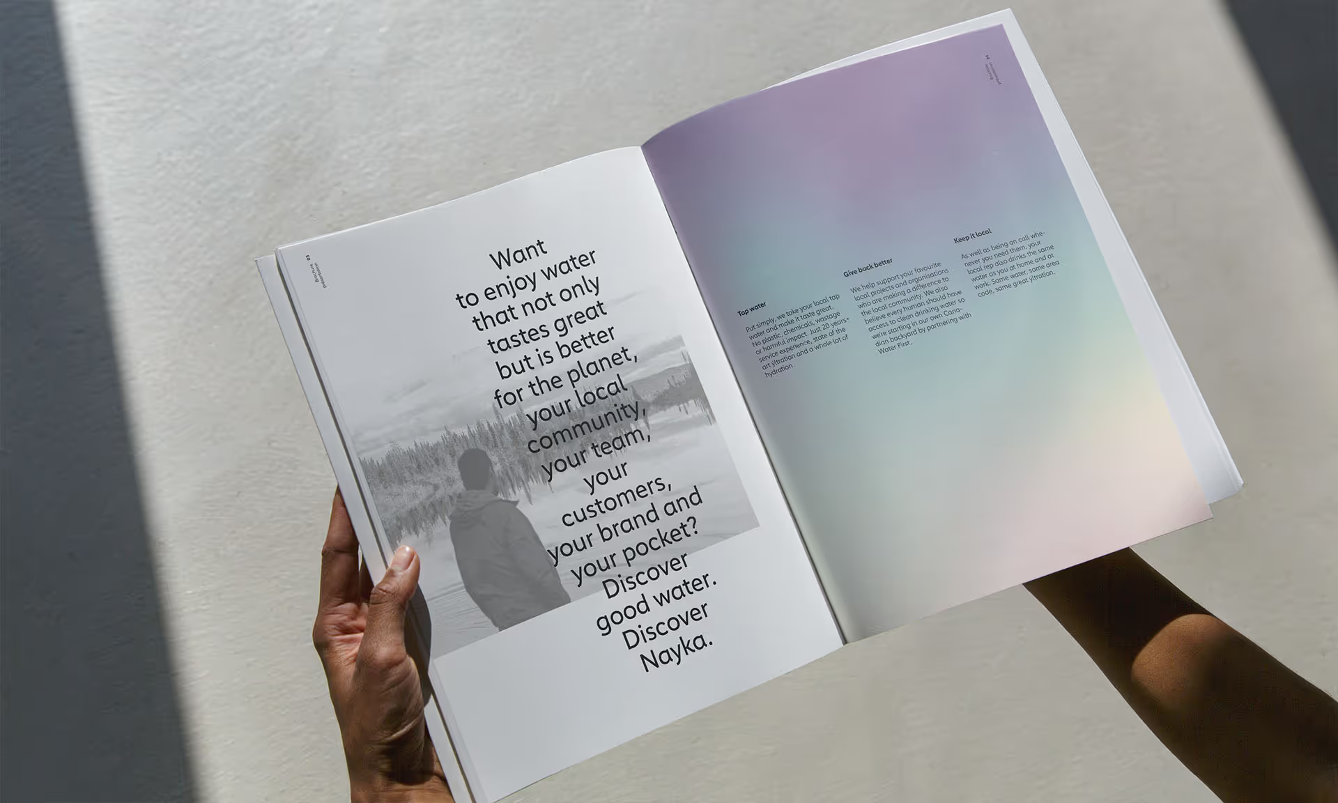
For the final touch, we added subtle hints of a rainbow filter here and there, to remind us of that elusive magic we feel when encountering water’s prism in nature.
